Custom Fields
Overview
Custom fields are a powerful tool to build content. We provide a variety of field types with the ability to outline into groups. Each field can be assigned into a single category or all categories.
Creating a Custom Field
Creating a custom field involves setting certain options. To create a custom field, click New as shown in the following image.
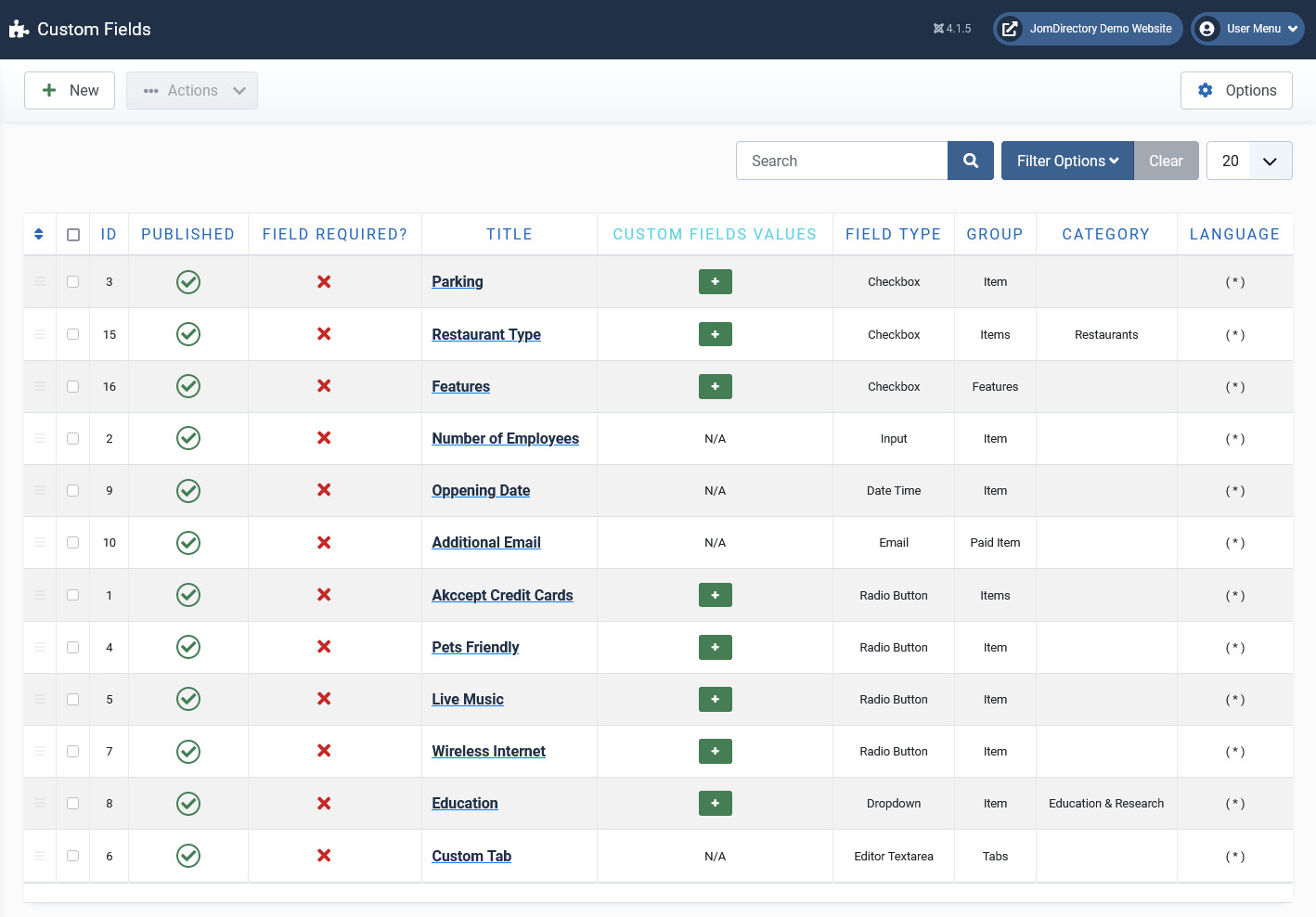
Screen 1: Custom Field screen
The following table explains the different options available on the screen.
|
New |
Creates a new Custom Field. |
|
Edit |
Provides the edit mode to make changes to the existing level or titles created. |
|
Publish |
Publishes the created custom field. |
|
Unpublish |
Removes the entry from the list of published custom fields. |
|
Archive |
Archives custom fields that are not used anymore. |
|
Trash |
Deletes the custom fields that are not required anymore. |
|
Options |
Navigates to the Extension options screen. |
Editing Custom Fields
If you want to edit existing entries, you can either click the entry from the Custom Fields screen or select the checkbox next to the entry, and then click Edit.
Custom Field Edit
After you click the required entry that you need to edit, you can change the configurations for the fields as shown in the following image.
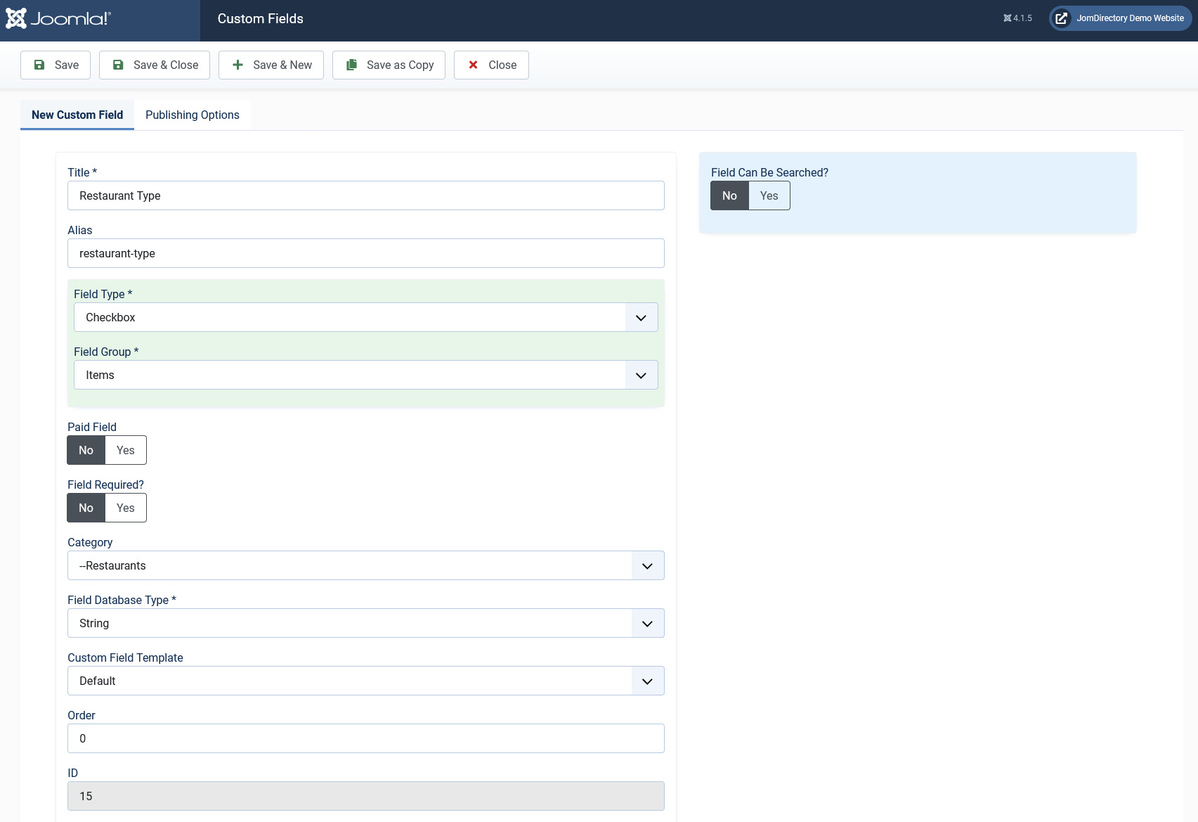
Screen 2: Custom Field Edit tab
The following table explains the different options seen on the screen:
Custom Field Edit |
Title |
Title for the Custom Field. |
|
Alias |
URL alias for “SEF/SEO” URL. |
|
|
Order |
Provide a value from 1 onwards. The lowest value will appear on the top. |
|
|
Field Required? |
Enable whether to make the field required. |
|
|
Category |
Category where the Custom Field will be published. When you select a custom field for a particular category, it is visible only for that category. While creating a listing if you select the said category and save, the custom field is available only then.
|
|
|
Field Type |
Set the Field Type for the Custom Field. For more information, see the Field Type Table. |
|
|
Field Database Type |
Set the field type, needed for database settings.
|
|
|
Field Group |
There are 5 custom field groups. Custom fields are grouped into groups. It has many advantages, one of them is display purposes. There are few groups available:
JomEstate, JomEvents only
Groups are static and cannot be created.
Paid groups are related to the membership plans that are applied to custom fields. Paid Items are displayed in the Items list, while the Paid Item is displayed in an Item (detailed) view.
|
|
|
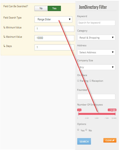
Field Can Be Searched |
Enable to make the field values searchable. This setting applies only for the Search Module -> Layout Filter.
|
|
|
Field Search Type |
Provide the type of search option to include:
Depending on the Field search type you select, the search criteria field will be displayed in the search module – layout side search. This field is functional when the Field Type is selected as Input and Field can be searched set to Yes
|
|
|
Minimum Value |
When, as an example, the Range Dropdown option is selected, you can select the range between which the options can be selected. For example, for Price range between X and Y, with incremental steps of 2, you can set x value in this field. |
|
|
Maximum Value |
Set the Y value for the range in this field. |
|
|
Steps |
Define the incremental steps. For example, for increments of x+2, provide the value as 2. |
|
|
Custom Field Template |
Custom fields have own templates that can be used and customized. There are 3 templates available:
If you would like to create and customize your own templates, see the Developer Guide. |
|
|
ID |
This field is auto - generated. |
|
Custom fields values area |
Add new |
If the field type is selected to hold multiple values, this button lets you create the multiple values. |
|
Delete |
Delete the value. |
Custom Field Values
This area lets you create values when the field type requires multiple options to be provided.
For custom fields that can have values, to add multiple values, navigate to the custom fields listing screen. Click the  icon next to the field where you want to add values as shown in the following image.
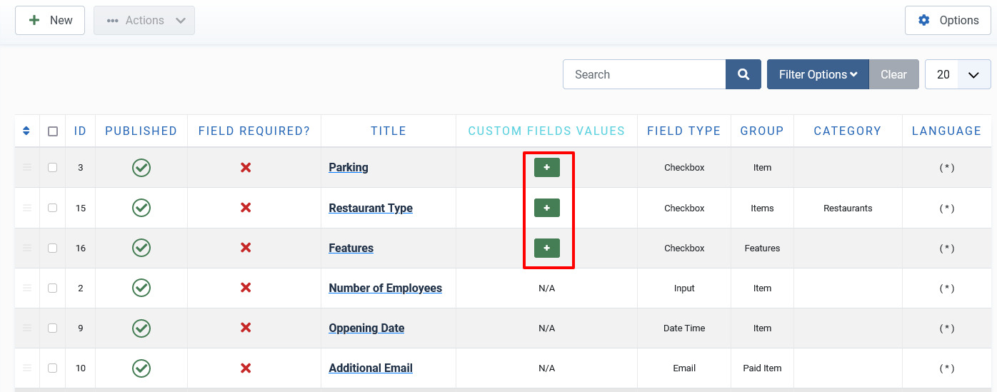
Screen 3: Adding values to custom fields area
Here, the Field Type is selected as Checkbox and the Field Database Type has been stated as String. This means the Custom fields value area should provide options that can be seen when editing listing and displayed on the component front page. Hence, the Sample Values are provided in this area as Street, Garage, Underground. The following screen shows the values added at the back end. Click Delete to delete the entry.
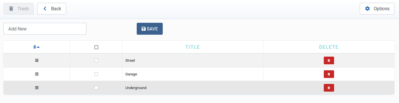
Screen 4: Values added to custom field area
The following image shows how the field looks on the add listings page.
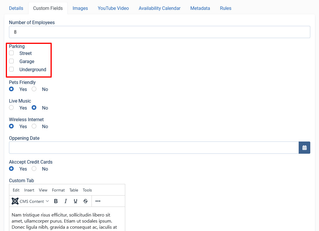
Screen 5: Custom Field as seen on new listing page
The custom field is seen on the listings page as shown in the following image:
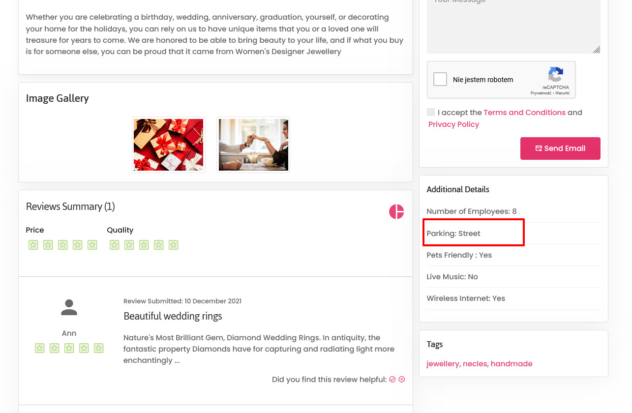
Screen 6: Custom Field as seen on published listing page
Field Types
With Extension extension, you get several field types that you can create based on your requirement. The following image shows the available field types.

Screen 7: Field Types
The following table explains the different options seen on the screen.
|
Type |
Multiple select |
Multiple Values |
Description |
|
Radio button |
No |
Yes |
Standard radio button with multiple values |
|
Checkbox |
Yes |
Yes |
Standard check boxes with multiple values |
|
Dropdown |
No |
Yes |
Dropdown (select) field with multiple values |
|
Multiple Select |
Yes |
Yes |
Select box with multiple values |
|
Input |
No |
No |
Single text box |
|
Web Address |
No |
No |
Single text box for URL, it will display as the link in the front page |
|
|
No |
No |
Single text box for email |
|
Text |
No |
No |
Text area |
|
Date Time |
No |
No |
Select a date and time from the Calendar icon on screen. |
|
Date |
No |
No |
Select a date from the Calendar icon on screen. |
|
Editor textarea |
No |
No |
Creates a rich text editor box, it can be combined with Tabs group. |
Publishing tab
After you have provided the above information, you can provide the publishing information in the Publishing tab.
You can change the values for the given options using the following table.
|
Status |
Based on the status seen here, the visibility changes as follows:
|
|
Language |
Select the language for the address entry. To create a custom field that applies to a particular language, you need to select the appropriate language from the drop down. For each language that you want it to appear for, create a separate entry.
|
|
Created Date |
Date when the entry was created. |
|
Start Publishing |
Date when publishing needs to start in case of limited viewing of the field. |
|
Finish Publishing |
Date when publishing needs to stop in case of limited viewing of the field. |
|
Modified Date |
Date when the entry was modified. |
JomEstate custom fields: Beds, Baths, Garage
For custom fields such as Bed, Bath, and Garage, icons are displayed alongside. To change the style css for these icons, edit the jomestate.css file located in the components/com_jomestate/assets/css folder. These icons are only available for the single language. If the site is multilingual than additional suffixes are added, therefore additional styles needs to be created.
.beds .jd-lab-horizontal-float-icon {background: url("../images/beds.png") 0 50% no-repeat;}
.baths .jd-lab-horizontal-float-icon {background: url("../images/baths.png") 0 50% no-repeat;}
.garage .jd-lab-horizontal-float-icon {background: url("../images/car.png") 0 50% no-repeat;}