**Tip:** When deleting a listing, it is moved to the **Trash** rather than being permanently removed. **To delete a listing permanently**, first move it to the Trash, then change the filter to *Trashed* and remove it from there.
#### Featured content [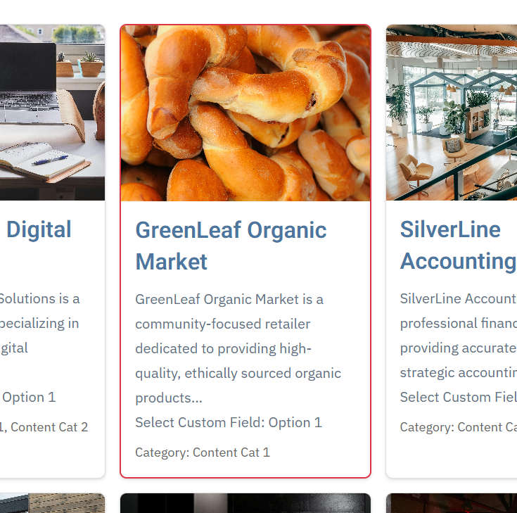](https://wiki.comdev.eu/uploads/images/gallery/2026-01/1Dtimage.png) Featured listings are special markers applied to selected listings to increase their visibility and prominence in grid and list views. Featured content is typically displayed in a more noticeable way, making it more attractive and easier for visitors to find. To set a listing as featured, click the Featured icon or select the listing using the checkbox and then use the Featured action button at the top of the list. This allows administrators to highlight important or priority content with minimal effort. ### Content Creation and Editing [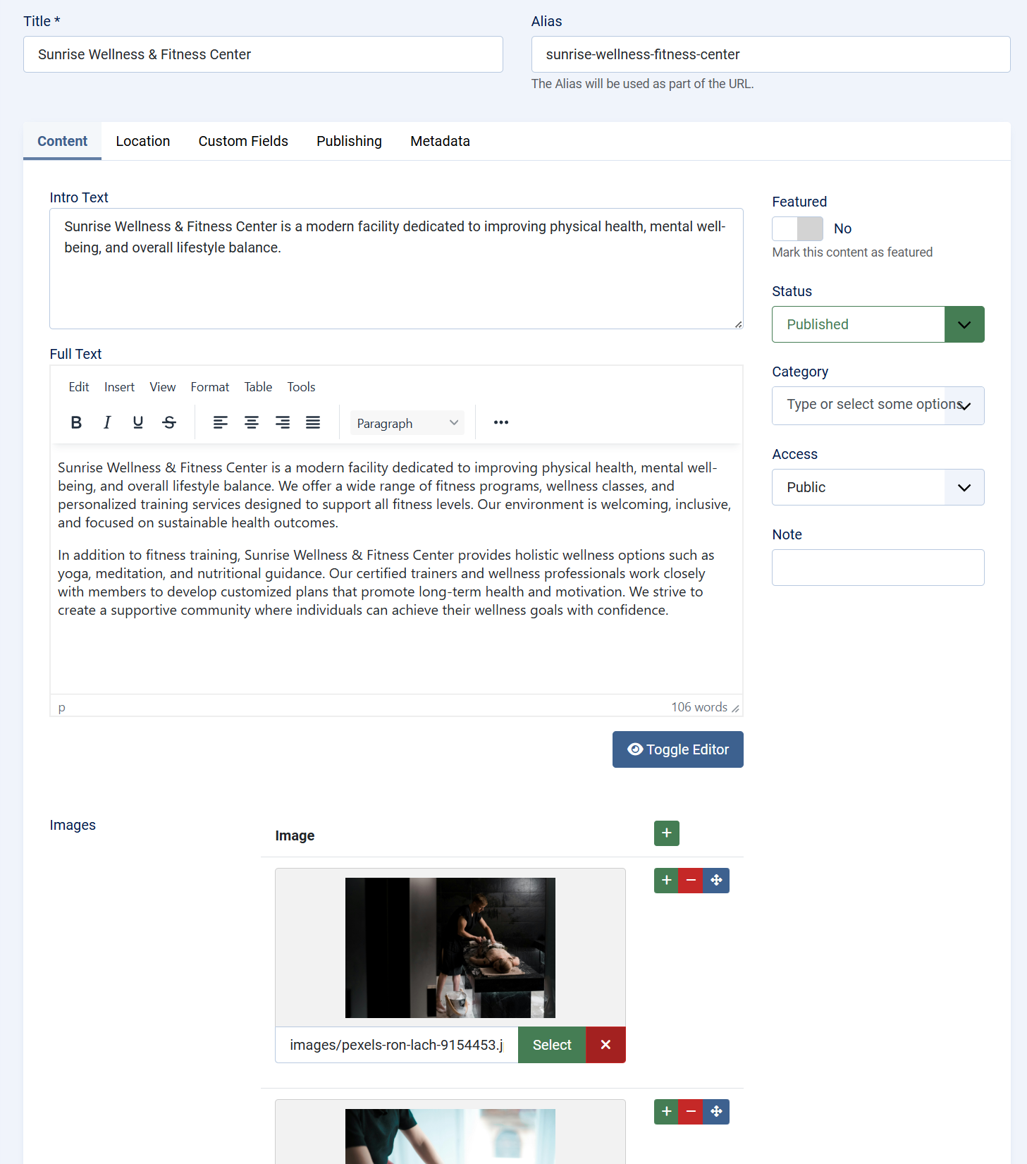](https://wiki.comdev.eu/uploads/images/gallery/2026-01/NRlimage.png) When creating or editing a content item, administrators define both the core identity of the entry and its extended data. This typically includes: - A title and descriptive content - Assignment to one or more categories - Publication and access control settings The editing interface follows Joomla conventions, ensuring a familiar workflow while allowing the component to extend functionality beyond standard articles. ### Custom Fields Integration [Custom fields](https://wiki.comdev.eu/books/onecore-plus/page/custom-fields "Custom Fields") are a key part of the component’s flexibility. They allow content items to be enriched with structured, domain-specific data such as: - Contact details - Specifications and attributes - Pricing or availability information - Custom metadata relevant to the directory type Fields are grouped logically and can be reused across content items, ensuring consistency and making it possible to build complex directory-style layouts without custom development.TIP: For a custom field to be available in the content editing interface, it must be assigned to a custom field group that is linked to the content entity.
### Media Support Content items support media integration to enhance visual presentation. Images are commonly used to represent listings, products, or locations and are displayed both in list views and detailed views. This media support is essential for directory-style use cases, where visual identification significantly improves user engagement and usability. ### Location and Map Integration [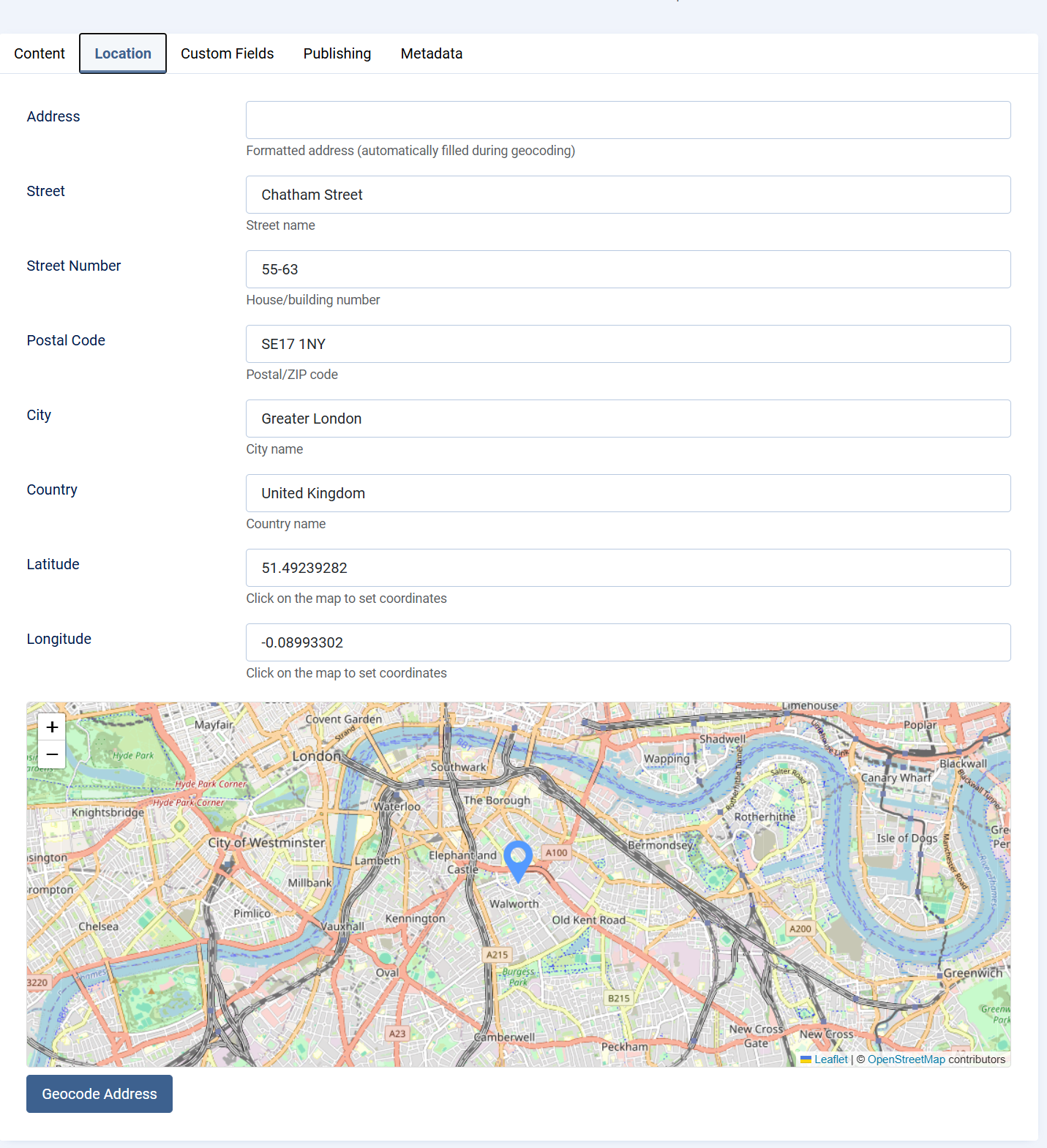](https://wiki.comdev.eu/uploads/images/gallery/2026-01/iZwimage.png) For location-based content, the component supports associating content items with geographic data. This enables: - Displaying items on maps - Filtering or searching by location - Building local or regional directories Location data transforms standard content into interactive, map-driven experiences, making the component suitable for local business directories, service locators, and similar applications. #### Location Setup The Location tab allows you to define an exact geographic position for an item using either the map or an address lookup. Both methods automatically populate all location fields. ##### Method 1: Set Location Using the Map (Marker) Scroll to the map at the bottom of the Location tab. **Click on the map or drag the marker to the desired position.** When the marker is placed, the system automatically fills in: Address (formatted) Street Street Number Postal Code City Country Latitude Longitude This method is ideal when you want to visually select or fine-tune the exact location. ##### Method 2: Set Location Using Address Geocoding **Enter the full address in the Address field (street, city, country).** **Click the Geocode Address button.** The system will automatically: Locate the address on the map Move the marker to the correct position Populate all location fields with accurate values This method is recommended when you have a complete address and want coordinates generated automatically. #### NotesYou can switch between both methods at any time. Updating the marker or re-geocoding will refresh all location data. Latitude and Longitude can also be adjusted manually if needed. The formatted Address field is generated automatically during geocoding. This ensures consistent and accurate location data for maps, search, and filtering.
## Summary Content is the foundation of the component and the primary driver of its functionality. By combining categories, custom fields, media, and optional location data, the component enables the creation of highly flexible and reusable content structures. This design allows a single extension to support a wide range of directory, listing, and informational use cases while remaining consistent with Joomla best practices. # Events ## Events Overview Events in OneCore extend the core content system by enabling the creation and management of time-based entries such as meetings, conferences, workshops, promotions, open days, or local happenings. The Events feature builds on the same flexible architecture used for listings and directories, while adding event-specific data such as dates, recurrence, and location. Events can be managed entirely from the Joomla administrator interface and displayed on the frontend in list, grid, calendar, or map-based views, depending on configuration. ### Purpose of Events The Events system is designed to support a wide range of use cases, including: - Business or community events - Training sessions and workshops - Promotional or marketing events - Real estate open houses - Local or regional event directories By combining structured event data with custom fields and media, OneCore Events can adapt to both simple and advanced event-management scenarios. ### Event Creation and Editing Creating or editing an event follows standard Joomla editing patterns, ensuring a familiar workflow for administrators. An event consists of: - A title and URL alias - Start and end date/time to define the event duration - A rich-text description for detailed information - Category and content associations for organization - Publication status and access level controls All changes made in the event editor directly affect how the event is presented on the frontend. ### Event Dates and Time Each event includes a required start date and time, along with an optional end date and time. These values determine when the event is considered active and how it is displayed in chronological listings or calendars. This time-based structure allows OneCore to accurately sort, filter, and display upcoming, ongoing, and past events. ### Recurrence Support OneCore **PLUS** Events includes built-in recurrence support, allowing administrators to create repeating events without duplicating entries. This feature is ideal for regularly scheduled activities such as classes, meetings, workshops, or ongoing programs. [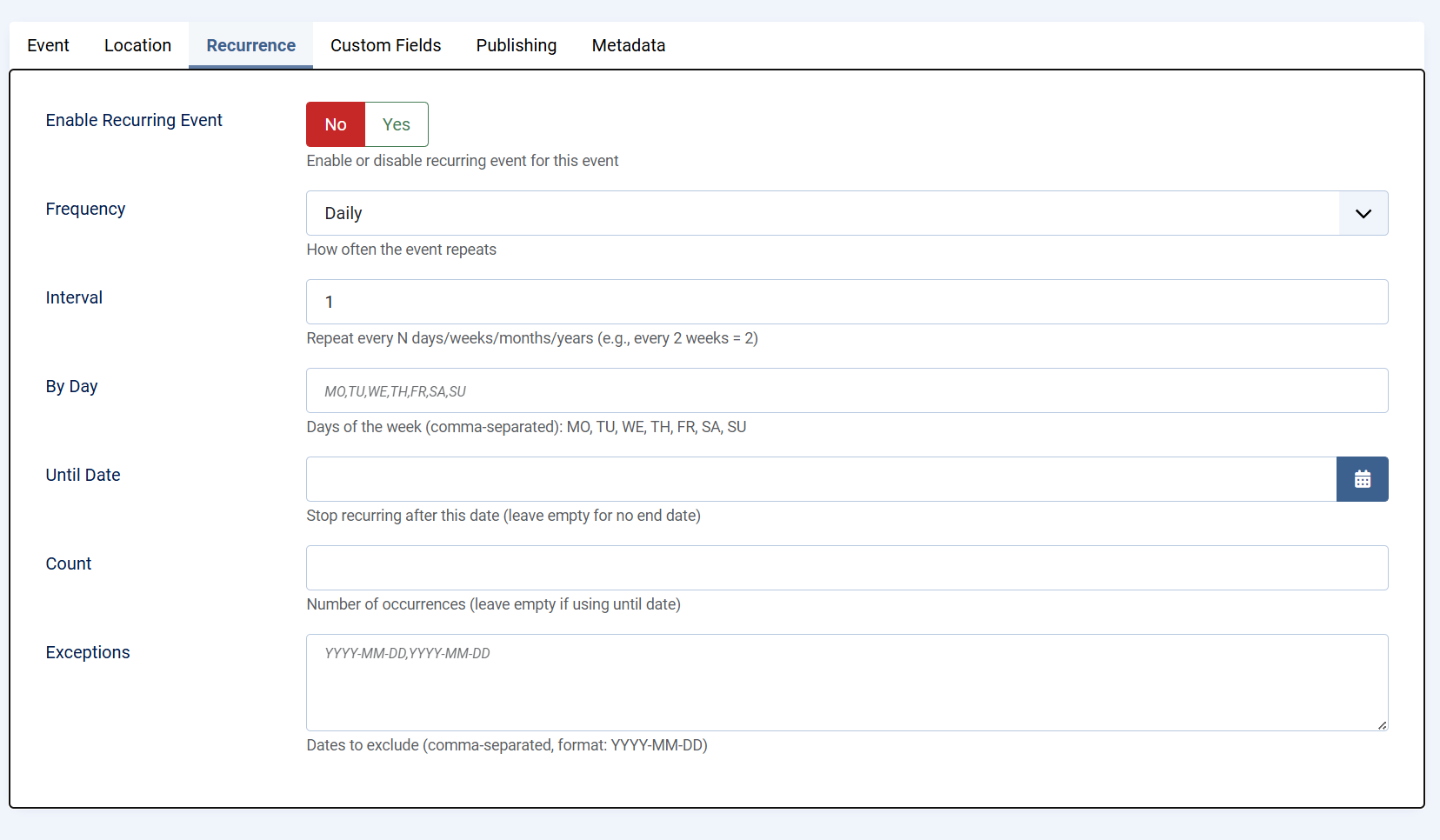](https://wiki.comdev.eu/uploads/images/gallery/2026-02/image.png) #### Enable Recurring Event When recurrence is enabled, the event is treated as a repeating series rather than a single occurrence. Administrators can enable or disable recurrence at any time, giving full control over whether the event repeats. #### Frequency The frequency defines how often the event repeats. Available options include daily, weekly, monthly, or yearly repetition. This setting establishes the base pattern for the recurring event. #### Interval The interval determines how often the selected frequency is applied. For example: - Interval set to 1 repeats the event every day, week, month, or year - Interval set to 2 repeats the event every two days, weeks, months, or years This allows flexible scheduling without creating multiple rules. #### By Day For weekly recurrence, specific days of the week can be selected using standard weekday codes: MO, TU, WE, TH, FR, SA, SU Multiple days can be defined using a comma-separated list. This is useful for events that occur on multiple days within the same week, such as classes held every Monday and Wednesday. #### Until Date The Until Date option defines when the recurring event series should stop. Once this date is reached, no further occurrences will be generated. Leaving this field empty creates an open-ended recurring event. #### Count As an alternative to using an end date, the Count option limits the recurrence to a specific number of occurrences. Once the defined number is reached, the event series automatically ends. #### Exceptions Exceptions allow individual dates to be excluded from the recurrence pattern. This is useful for skipping holidays, cancellations, or special cases without modifying the overall recurrence rules. Together, these recurrence options provide precise control over repeating events while keeping event management simple and efficient. ### Custom Fields Integration Events fully support OneCore custom fields, enabling administrators to extend event data with structured information such as: - Registration details - Ticket prices - Speaker or organizer information - Event-specific metadata Custom fields must be assigned to a custom field group linked to the Events entity in order to appear in the event edit screen. ### Media Support Events can include images to enhance visual presentation. Media is commonly used for banners, promotional graphics, or venue photos and can be displayed in both event listings and detail views. Rich media improves engagement and helps events stand out in crowded listings. ### Location and Map Integration Events can be linked to a physical location, allowing them to be displayed on maps and filtered by geographic area. This is particularly useful for local events, venues, or multi-location event directories. Location data enables map-based browsing and improves discoverability for users searching by area. ### Publishing and Access Control Each event includes standard Joomla publishing controls, allowing administrators to: - Publish or unpublish events - Schedule visibility using dates - Restrict access based on user groups These controls ensure events are visible only to the intended audience and at the appropriate time. # Custom Fields ## Custom Fields – Overview Custom Fields in OneCore allow you to extend standard content types (such as events, listings, or articles) with additional, configurable data fields. This makes it possible to tailor content structures to specific project requirements without modifying core code. Custom fields are organized into [**Field Groups**](https://wiki.comdev.eu/books/onecore-plus/page/custom-fields-group "Custom Fields Group"), which are then assigned to specific content entities. Once assigned, all fields within the group become available when creating or editing content of that type. --- ### Field Groups A Field Group defines where and how a set of custom fields is used. - Field groups are linked to a specific content entity (for example, Events or Listings). - Only field groups assigned to an entity will display their fields in the content edit form. - Field groups help keep content structured, consistent, and easier to manage. --- ### Creating a Custom Field When creating a custom field, you define both its basic identity and its behavior.Before creating first custom field, as least one custom fields group needs to be created.
[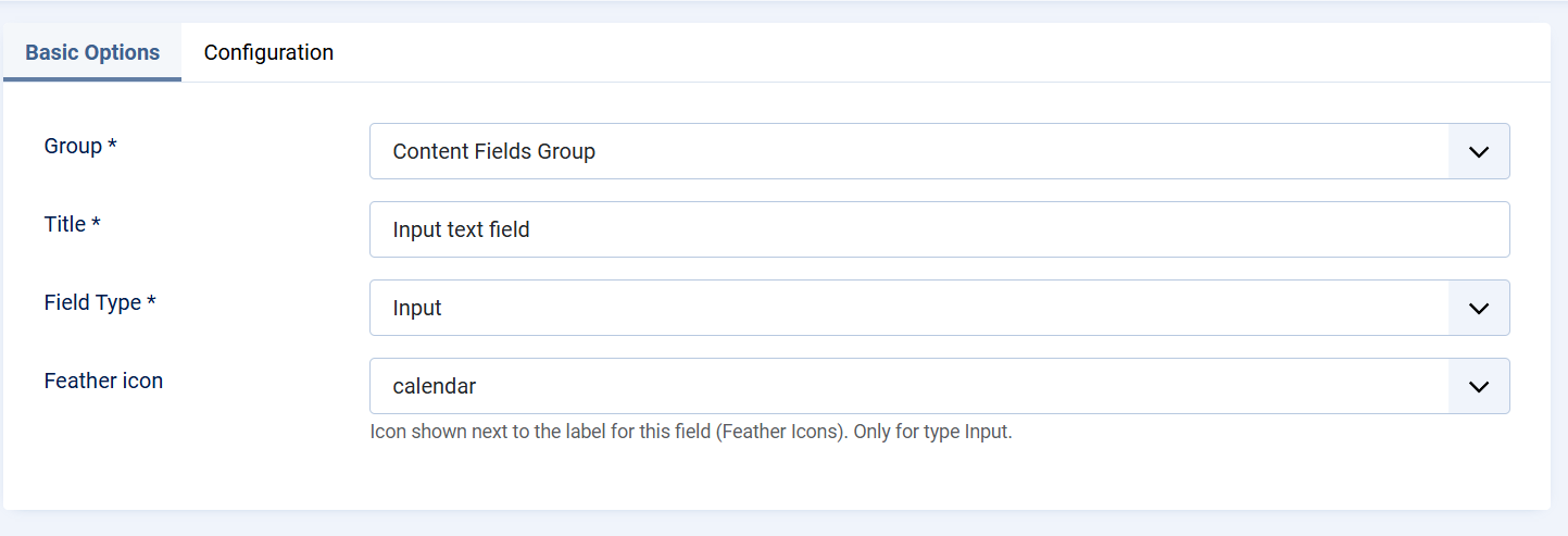](https://wiki.comdev.eu/uploads/images/gallery/2026-02/Wmyimage.png) #### Basic Options - **Group** Select the Field Group this field belongs to. This determines where the field will appear. - **Title** The label displayed to content editors in the backend. - **Field Type** Defines the type of input used to store data (for example, text input). The field type controls how users enter data and how it is stored. - **Icon (Feather Icon)** An optional icon displayed next to the field label. This improves visual clarity and usability, especially for frequently used fields. --- ### Field Configuration The Configuration tab controls how the field behaves and how it is presented. [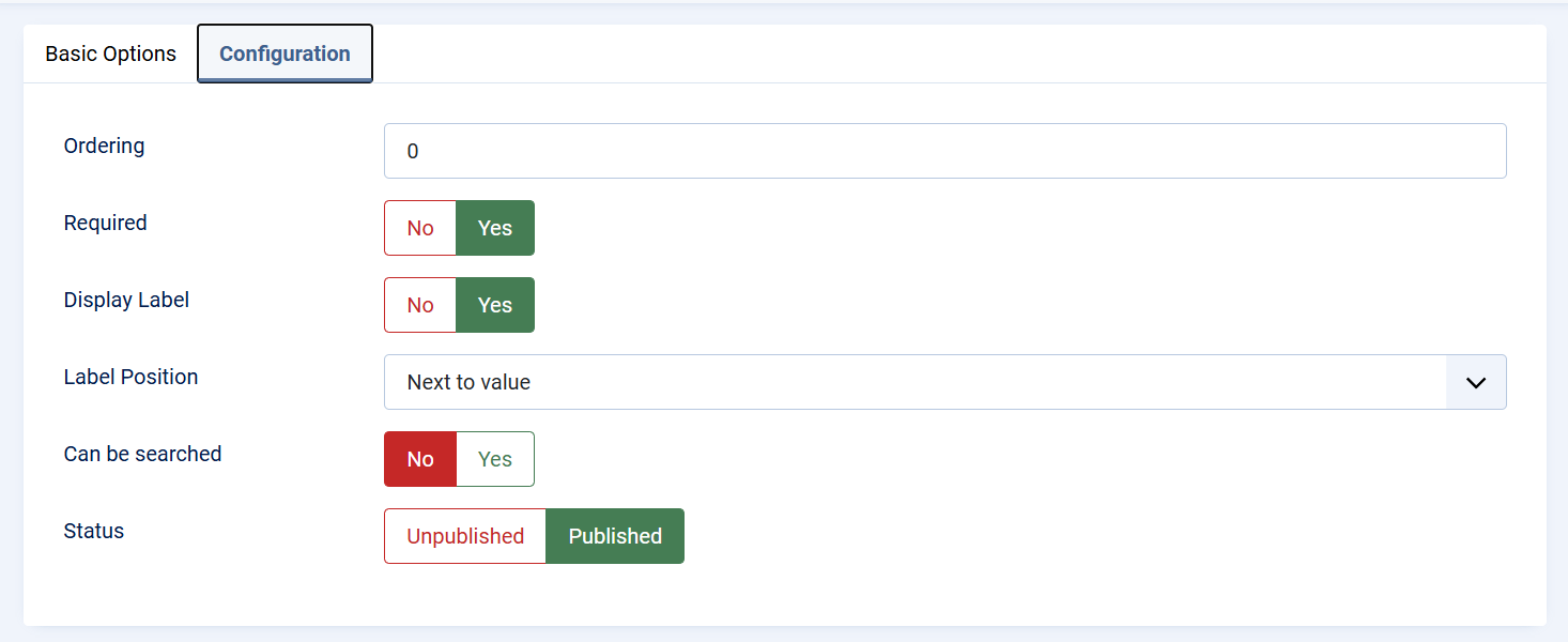](https://wiki.comdev.eu/uploads/images/gallery/2026-02/mlZimage.png) - **Ordering** Determines the position of the field within the form. Lower values appear first. - **Required** When enabled, the field must be filled in before the content can be saved. - **Display Label** Controls whether the field label is visible in the front end of the extension - **Label Position** Defines where the label is displayed relative to the field value (for example, next to the value). - **Searchable** Enables the field to be used in search and filtering features, making the content easier to find on the frontend or backend. - **Status** Controls whether the field is published and available for use. Unpublished fields are not shown in content forms. --- ### Publishing and Visibility Only **published fields** that belong to a **published field group** assigned to the correct content entity will appear in the content editor. This ensures full control over which fields are active and visible to content managers. --- ### Usage in Content Once configured and published: - Custom fields appear automatically in the content edit view. - Values entered by editors are stored with the content item. - Fields can be displayed on the frontend, used for filtering, or included in layouts depending on the component configuration. [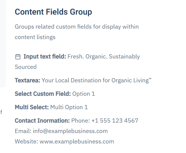](https://wiki.comdev.eu/uploads/images/gallery/2026-02/y8Wimage.png) --- ### Best Practices - Group related fields together to keep forms clean and intuitive. - Use clear and descriptive titles to avoid confusion for editors. - Mark only essential fields as required to maintain flexibility. - Enable search only for fields that add real value to filtering or discovery. # Custom Fields Group ## Custom Field Groups Custom Field Groups in OneCore are used to organize related custom fields and control where and how those fields are displayed. A field group acts as a container that defines **visibility, context, and layout placement** for all fields assigned to it. Field groups must be properly configured and published in order for their fields to appear in content or event edit forms and on the frontend. [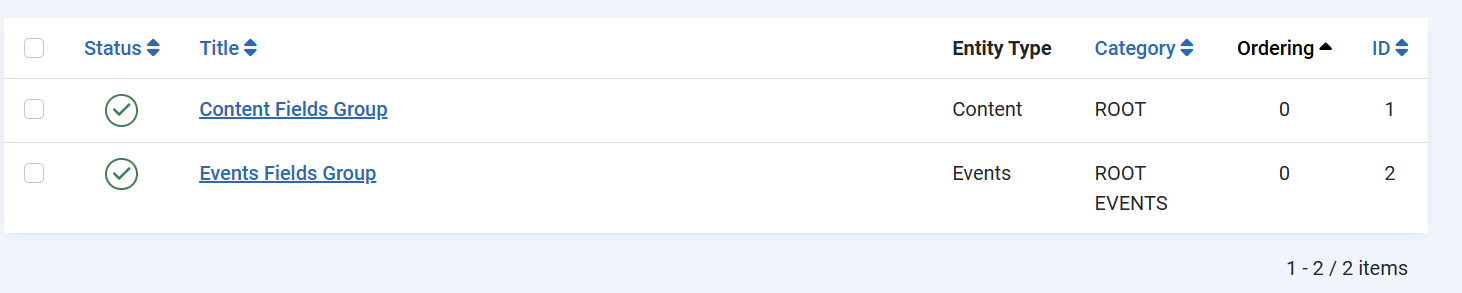](https://wiki.comdev.eu/uploads/images/gallery/2026-02/xmRimage.png) --- ### Group Details #### Title and Description - **Title** The name of the field group. This title can optionally be displayed in the frontend, depending on display settings. - **Description** An optional description that explains the purpose of the group. This can also be shown or hidden based on configuration. --- ### Entity Assignment (Visibility) [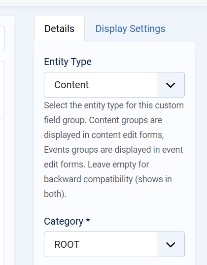](https://wiki.comdev.eu/uploads/images/gallery/2026-02/OPRimage.png) The **Entity Type** determines where the field group is available: - **Content** The group and its fields appear in standard content (listing/article) edit forms. - **Events** The group and its fields appear in event edit forms. - **Empty (Backward Compatibility)** If no entity type is selected, the group will be visible in both Content and Events. Only field groups assigned to the correct entity type will be visible when creating or editing items of that type. --- ### Category Assignment - **Category** Defines the category scope in which the field group is available. Using **`ROOT`** makes the group available globally, while selecting a specific category limits visibility to that category and its children. --- ### Display Options #### Show Title Controls whether the group title is displayed on the frontend. #### Show Description Controls whether the group description is displayed on the frontend. #### Ordering Defines the position of the field group relative to other groups. Lower values appear first. #### Status Only **Published** field groups are active and visible. Unpublished groups and their fields are hidden from both backend forms and frontend output. --- ### Display Settings The **Display Settings** tab defines where the field group is rendered on the frontend. These settings apply to all fields within the group. #### Position (Items List) Controls where the group is displayed in list or grid views (for example, category listings). - **Under Intro Text** The group is shown below the item’s intro/summary text. --- #### Position (Single Item) Controls placement when viewing a single content item or event. - **Sidebar** The group is displayed in the sidebar area, making it suitable for metadata or supplementary information. --- #### Position (Module) Controls how the field group is rendered when used inside a module. - Allows the same group to be reused consistently across different module-based layouts. --- ### Publishing Rules and Dependencies For custom fields to appear correctly: - The **field group must be published** - The **field group must be assigned to the correct entity type** - The **custom fields within the group must also be published** - The group’s display settings must match the active layout (list, single item, or module) If any of these conditions are not met, the group and its fields will not be visible. --- ### Best Practices - Create separate field groups for Content and Events to keep structures clear. - Use Display Settings to avoid cluttering main content areas. - Place informational or secondary fields in the sidebar for better readability. - Use ordering to control the logical flow of information.