OneCore Plus
Installation Guide, User Documentation, and Component Configuration
Installation and Upgrade
Overview
This document describes the procedures for installing, updating, and upgrading a Joomla component using the Joomla Administrator interface. It applies to Joomla versions that support the Extensions Manager and Update Server mechanism.
System Requirements
Before installing or upgrading the component, ensure the following:
-
A supported Joomla version is installed (as specified by the component vendor).
-
Administrator access to the Joomla backend.
-
PHP, database, and server requirements meet Joomla and component requirements.
-
A full site and database backup has been completed.
Component Installation
Method 1: Install from Package File (Recommended)
-
Log in to the Joomla Administrator panel.
-
Navigate to System → Install → Extensions.
-
Under the Upload Package File tab:
-
Click Browse and select the component installation package (
.zipfile). -
Click Upload & Install.
-
-
Wait for the installation process to complete.
-
Confirm the success message indicating the component was installed successfully.
Method 2: Install from URL (Optional)
-
Log in to the Joomla Administrator panel.
-
Navigate to System → Install → Extensions.
-
Select the Install from URL tab.
-
Enter the direct URL to the component installation package.
-
Click Install.
-
Verify the installation success message.
Post-Installation Steps
After installation:
Component Upgrade Using Joomla Update Server
The component supports upgrades via the Joomla Update Server, allowing administrators to receive and apply updates directly from the backend.
Configuring the Update Server
-
Log in to the Joomla Administrator panel.
-
Navigate to System → Update → Extensions.
-
Click Update Sites.
-
Locate the update site for the component:
-
Ensure the update site is Enabled.
-
If missing, reinstall the component or manually add the update site as provided by the vendor.
-
-
Click Rebuild to refresh the update sites list.
Performing the Upgrade
Post-Upgrade Verification
After upgrading:
Troubleshooting
-
Update not appearing:
Rebuild update sites and clear Joomla cache. -
Installation or upgrade fails:
Review Joomla error messages and server error logs. -
Missing update site:
Reinstall the component or manually add the update site URL.
Uninstallation (Optional)
Dashboard
Overview
The Joomla Component Dashboard is the primary entry point for managing the component within the Joomla Administrator. Its role is to provide administrators and content managers with a clear, consolidated overview of the component’s status, activity, and readiness, without requiring deep navigation into individual management screens.
The dashboard is intentionally high-level. It focuses on visibility, orientation, and efficiency rather than detailed configuration or data entry.
Purpose
The dashboard is designed to support both initial setup and ongoing operation of the component. It enables users to quickly understand:
-
Whether the component is actively being used
-
How content creation and usage are trending
-
What actions are recommended to complete setup or improve usage
By surfacing this information immediately, the dashboard reduces administrative friction and shortens the learning curve for new users.
Functional Role
Within the overall component workflow, the dashboard serves as a control and monitoring layer. It does not replace dedicated views for managing content, users, or settings. Instead, it provides context and direction, helping users decide where to go next and what actions are most relevant at any given time.
The dashboard also acts as a central access point for creating new content and accessing configuration options, ensuring that common tasks are always within reach.
User Experience Principles
The dashboard follows standard Joomla administrator interface conventions to ensure consistency and usability. Information is presented in a structured and visual manner to allow quick assessment at a glance, while guidance text helps users understand available capabilities and recommended actions.
Where applicable, the dashboard communicates feature availability and licensing status, allowing administrators to make informed decisions about enabling advanced functionality.
Summary
In summary, the Joomla Component Dashboard is a strategic overview screen that brings together insight, guidance, and access. It helps administrators monitor activity, orient themselves within the component, and efficiently manage content and configuration from a single, centralized interface.
Categories
Component Categories Overview
Categories in the Joomla component provide a structured way to organize and group content such as listings or events. They establish a hierarchical taxonomy that improves content management in the administrator interface and enhances navigation and filtering on the frontend.
Categories can be arranged in parent–child relationships, allowing administrators to create simple or complex category trees depending on site requirements. This structure supports scalability as content grows over time.
Categories List Screen
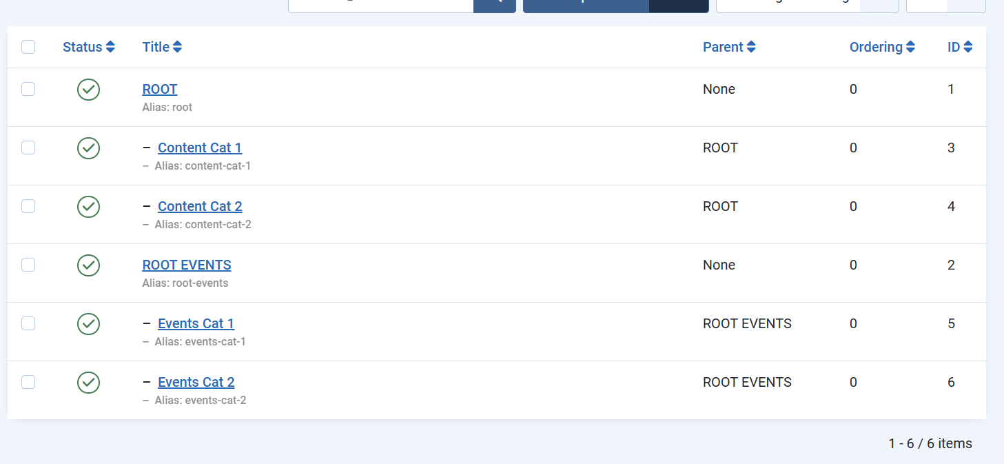
The Categories List screen displays all categories associated with the component in a hierarchical view. This screen is primarily used for overview and management purposes.
Administrators can quickly assess the category structure, including root-level categories and their children, as well as the publication status and ordering of each category. The hierarchical display makes it easy to understand how content is grouped and how categories relate to one another.
From this screen, common management actions such as publishing, unpublishing, reordering, or selecting categories for editing are performed. The list view serves as the central control point for maintaining an organized and consistent category structure.
Category Edit Screen
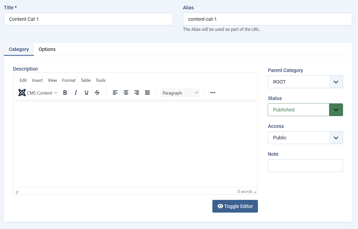
The Category Edit screen is used to create new categories or modify existing ones. It focuses on defining both the identity and behavior of a category within the component.
At a high level, this screen allows administrators to:
-
Define the category name and URL alias
-
Assign the category to a parent category to control hierarchy
-
Set publication status and access level
-
Provide descriptive content for contextual or frontend use
The edit interface follows standard Joomla patterns, ensuring consistency with core category management. This familiarity reduces the learning curve and helps administrators work efficiently.
Changes made on the Category Edit screen directly affect how content is organized and displayed throughout the component, making careful category planning an important part of overall site structure.
Summary
Component categories form the foundation of content organization within the Joomla component. The Categories List screen provides visibility and control over the category hierarchy, while the Category Edit screen enables precise definition and customization. Together, they support clear content structure, improved usability, and long-term maintainability of the site.
Content
Content Overview
Content is the core element of the Joomla component and represents the primary data managed and displayed by the extension. Depending on how the component is configured, content items can function as directory entries, business listings, car directories, service providers, news-style entries, or any other structured content type required by the site.
Each content item acts as a flexible container that combines core information, custom fields, media, and optional location data into a single, manageable entity.
Role of Content in the Component
The component is built around the idea that all meaningful output—whether shown as a directory, catalog, or listing view—is driven by content items. Categories define structure, but content provides the actual value presented to site visitors.
This approach allows administrators to use the same system to power a wide variety of use cases without changing the underlying architecture. By adjusting categories, custom fields, and presentation layouts, the component can adapt to multiple scenarios such as:
-
Business or service directories
-
Car or product listings
-
Local guides or location-based directories
-
Structured news or informational content
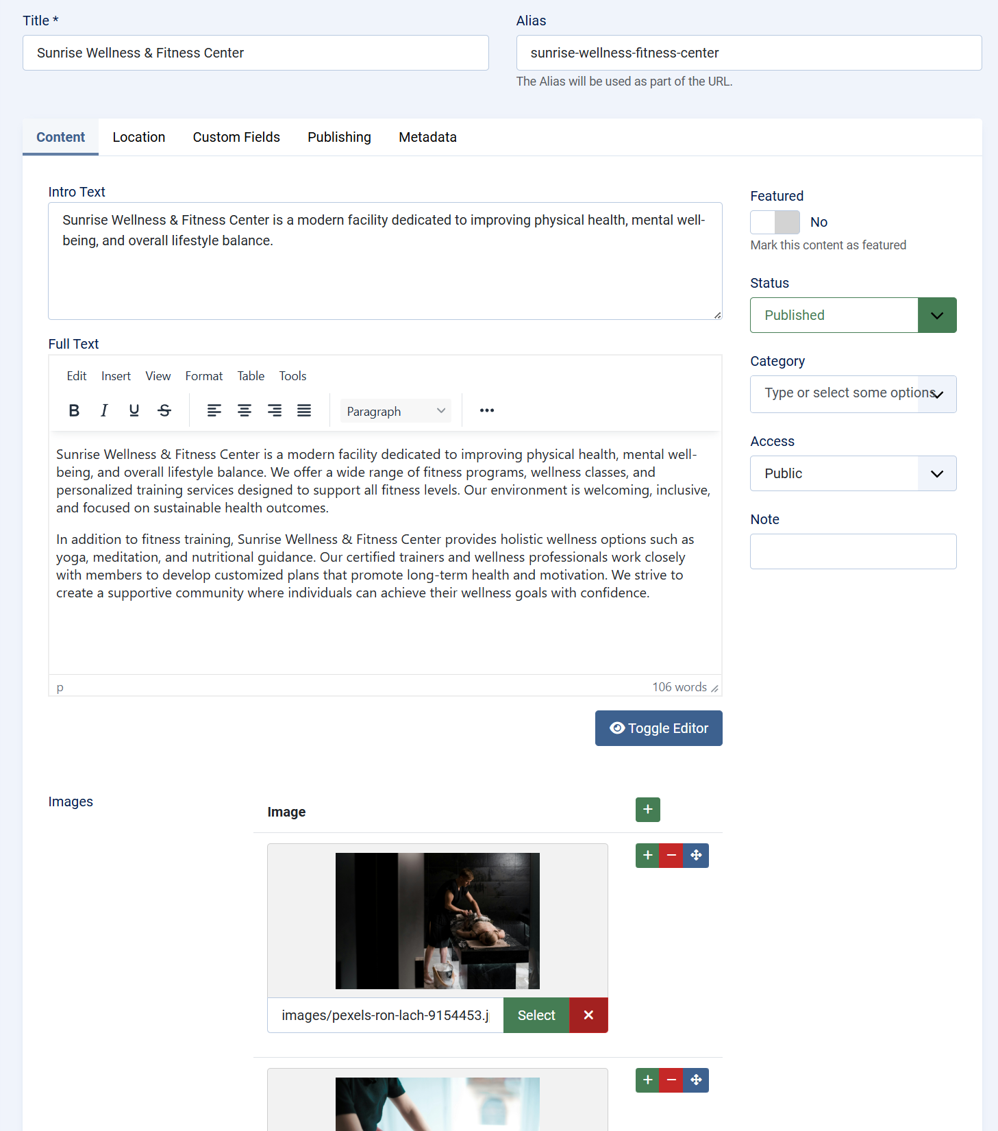
Content List Screen
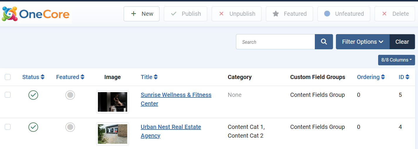
The Content List screen provides an overview of all content items created within the component. It is designed for efficient management and bulk operations.
From this view, administrators can quickly assess publication status, featured state, category assignments, and ordering. Visual elements such as thumbnail images help identify content at a glance, which is especially useful for media-rich directories.
The list screen serves as the operational hub for managing large volumes of content and maintaining consistency across the site.
Edit, Delete, Unpublish
To delete, publish, or unpublish a listing, select the checkbox next to the desired listing and use the action buttons at the top of the screen (Publish, Unpublish, Delete, etc.).
To edit a listing, click on its title in the content list. This will open the listing in the edit screen, where you can update its details, custom fields, media, and other settings.
Tip: When deleting a listing, it is moved to the Trash rather than being permanently removed. To delete a listing permanently, first move it to the Trash, then change the filter to Trashed and remove it from there.
Featured content
Featured listings are special markers applied to selected listings to increase their visibility and prominence in grid and list views. Featured content is typically displayed in a more noticeable way, making it more attractive and easier for visitors to find.
To set a listing as featured, click the Featured icon or select the listing using the checkbox and then use the Featured action button at the top of the list. This allows administrators to highlight important or priority content with minimal effort.
Content Creation and Editing
When creating or editing a content item, administrators define both the core identity of the entry and its extended data. This typically includes:
-
A title and descriptive content
-
Assignment to one or more categories
-
Publication and access control settings
The editing interface follows Joomla conventions, ensuring a familiar workflow while allowing the component to extend functionality beyond standard articles.
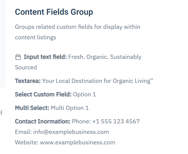
Custom Fields Integration
Custom fields are a key part of the component’s flexibility. They allow content items to be enriched with structured, domain-specific data such as:
-
Contact details
-
Specifications and attributes
-
Pricing or availability information
-
Custom metadata relevant to the directory type
Fields are grouped logically and can be reused across content items, ensuring consistency and making it possible to build complex directory-style layouts without custom development.
TIP: For a custom field to be available in the content editing interface, it must be assigned to a custom field group that is linked to the content entity.
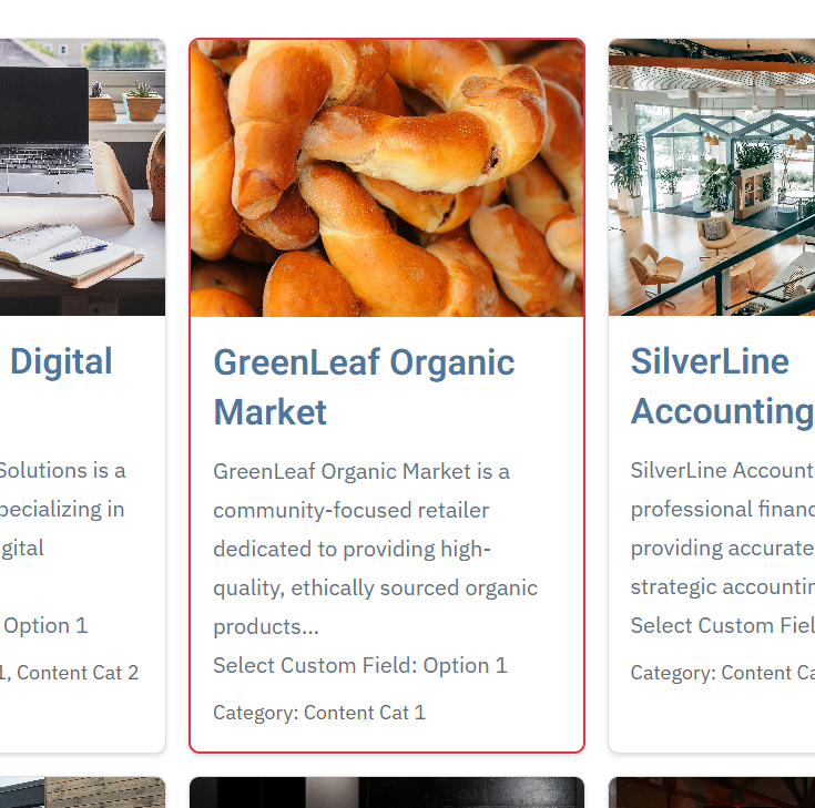
Media Support
Content items support media integration to enhance visual presentation. Images are commonly used to represent listings, products, or locations and are displayed both in list views and detailed views.
This media support is essential for directory-style use cases, where visual identification significantly improves user engagement and usability.
Location and Map Integration
For location-based content, the component supports associating content items with geographic data. This enables:
-
Displaying items on maps
-
Filtering or searching by location
-
Building local or regional directories
Location data transforms standard content into interactive, map-driven experiences, making the component suitable for local business directories, service locators, and similar applications.
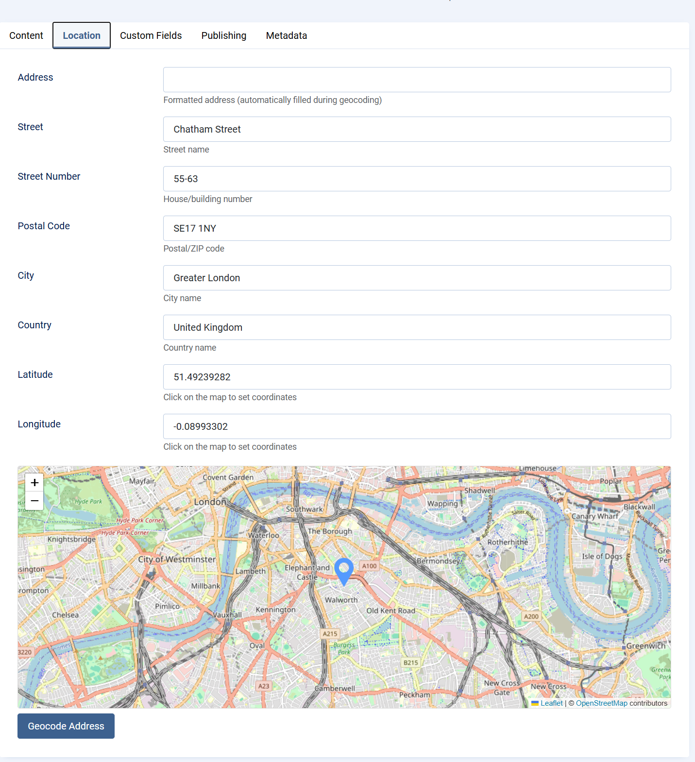
Location Setup
The Location tab allows you to define an exact geographic position for an item using either the map or an address lookup. Both methods automatically populate all location fields.
Method 1: Set Location Using the Map (Marker)
Scroll to the map at the bottom of the Location tab.
Click on the map or drag the marker to the desired position.
When the marker is placed, the system automatically fills in:
Address (formatted)
Street
Street Number
Postal Code
City
Country
Latitude
Longitude
This method is ideal when you want to visually select or fine-tune the exact location.
Method 2: Set Location Using Address Geocoding
Enter the full address in the Address field (street, city, country).
Click the Geocode Address button.
The system will automatically:
Locate the address on the map
Move the marker to the correct position
Populate all location fields with accurate values
This method is recommended when you have a complete address and want coordinates generated automatically.
Notes
You can switch between both methods at any time. Updating the marker or re-geocoding will refresh all location data. Latitude and Longitude can also be adjusted manually if needed. The formatted Address field is generated automatically during geocoding. This ensures consistent and accurate location data for maps, search, and filtering.
Summary
Content is the foundation of the component and the primary driver of its functionality. By combining categories, custom fields, media, and optional location data, the component enables the creation of highly flexible and reusable content structures. This design allows a single extension to support a wide range of directory, listing, and informational use cases while remaining consistent with Joomla best practices.
Events
Events Overview
Events in OneCore extend the core content system by enabling the creation and management of time-based entries such as meetings, conferences, workshops, promotions, open days, or local happenings. The Events feature builds on the same flexible architecture used for listings and directories, while adding event-specific data such as dates, recurrence, and location.
Events can be managed entirely from the Joomla administrator interface and displayed on the frontend in list, grid, calendar, or map-based views, depending on configuration.
Purpose of Events
The Events system is designed to support a wide range of use cases, including:
-
Business or community events
-
Training sessions and workshops
-
Promotional or marketing events
-
Real estate open houses
-
Local or regional event directories
By combining structured event data with custom fields and media, OneCore Events can adapt to both simple and advanced event-management scenarios.
Event Creation and Editing
Creating or editing an event follows standard Joomla editing patterns, ensuring a familiar workflow for administrators.
An event consists of:
-
A title and URL alias
-
Start and end date/time to define the event duration
-
A rich-text description for detailed information
-
Category and content associations for organization
-
Publication status and access level controls
All changes made in the event editor directly affect how the event is presented on the frontend.
Event Dates and Time
Each event includes a required start date and time, along with an optional end date and time. These values determine when the event is considered active and how it is displayed in chronological listings or calendars.
This time-based structure allows OneCore to accurately sort, filter, and display upcoming, ongoing, and past events.
Recurrence Support
OneCore PLUS Events includes built-in recurrence support, allowing administrators to create repeating events without duplicating entries. This feature is ideal for regularly scheduled activities such as classes, meetings, workshops, or ongoing programs.
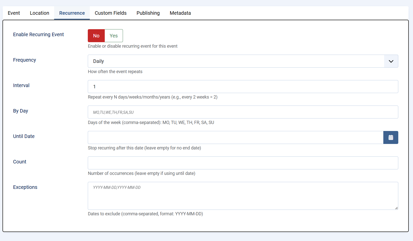
Enable Recurring Event
When recurrence is enabled, the event is treated as a repeating series rather than a single occurrence. Administrators can enable or disable recurrence at any time, giving full control over whether the event repeats.
Frequency
The frequency defines how often the event repeats. Available options include daily, weekly, monthly, or yearly repetition. This setting establishes the base pattern for the recurring event.
Interval
The interval determines how often the selected frequency is applied. For example:
-
Interval set to 1 repeats the event every day, week, month, or year
-
Interval set to 2 repeats the event every two days, weeks, months, or years
This allows flexible scheduling without creating multiple rules.
By Day
For weekly recurrence, specific days of the week can be selected using standard weekday codes:
MO, TU, WE, TH, FR, SA, SU
Multiple days can be defined using a comma-separated list. This is useful for events that occur on multiple days within the same week, such as classes held every Monday and Wednesday.
Until Date
The Until Date option defines when the recurring event series should stop. Once this date is reached, no further occurrences will be generated. Leaving this field empty creates an open-ended recurring event.
Count
As an alternative to using an end date, the Count option limits the recurrence to a specific number of occurrences. Once the defined number is reached, the event series automatically ends.
Exceptions
Exceptions allow individual dates to be excluded from the recurrence pattern. This is useful for skipping holidays, cancellations, or special cases without modifying the overall recurrence rules.
Together, these recurrence options provide precise control over repeating events while keeping event management simple and efficient.
Custom Fields Integration
Events fully support OneCore custom fields, enabling administrators to extend event data with structured information such as:
-
Registration details
-
Ticket prices
-
Speaker or organizer information
-
Event-specific metadata
Custom fields must be assigned to a custom field group linked to the Events entity in order to appear in the event edit screen.
Media Support
Events can include images to enhance visual presentation. Media is commonly used for banners, promotional graphics, or venue photos and can be displayed in both event listings and detail views.
Rich media improves engagement and helps events stand out in crowded listings.
Location and Map Integration
Events can be linked to a physical location, allowing them to be displayed on maps and filtered by geographic area. This is particularly useful for local events, venues, or multi-location event directories.
Location data enables map-based browsing and improves discoverability for users searching by area.
Publishing and Access Control
Each event includes standard Joomla publishing controls, allowing administrators to:
-
Publish or unpublish events
-
Schedule visibility using dates
-
Restrict access based on user groups
These controls ensure events are visible only to the intended audience and at the appropriate time.
Custom Fields
Custom Fields – Overview
Custom Fields in OneCore allow you to extend standard content types (such as events, listings, or articles) with additional, configurable data fields. This makes it possible to tailor content structures to specific project requirements without modifying core code.
Custom fields are organized into Field Groups, which are then assigned to specific content entities. Once assigned, all fields within the group become available when creating or editing content of that type.
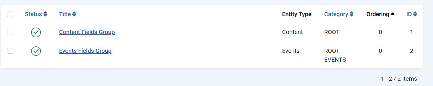
Field Groups
A Field Group defines where and how a set of custom fields is used.
-
Field groups are linked to a specific content entity (for example, Events or Listings).
-
Only field groups assigned to an entity will display their fields in the content edit form.
-
Field groups help keep content structured, consistent, and easier to manage.
Creating a Custom Field
When creating a custom field, you define both its basic identity and its behavior.
Before creating first custom field, as least one custom fields group needs to be created.
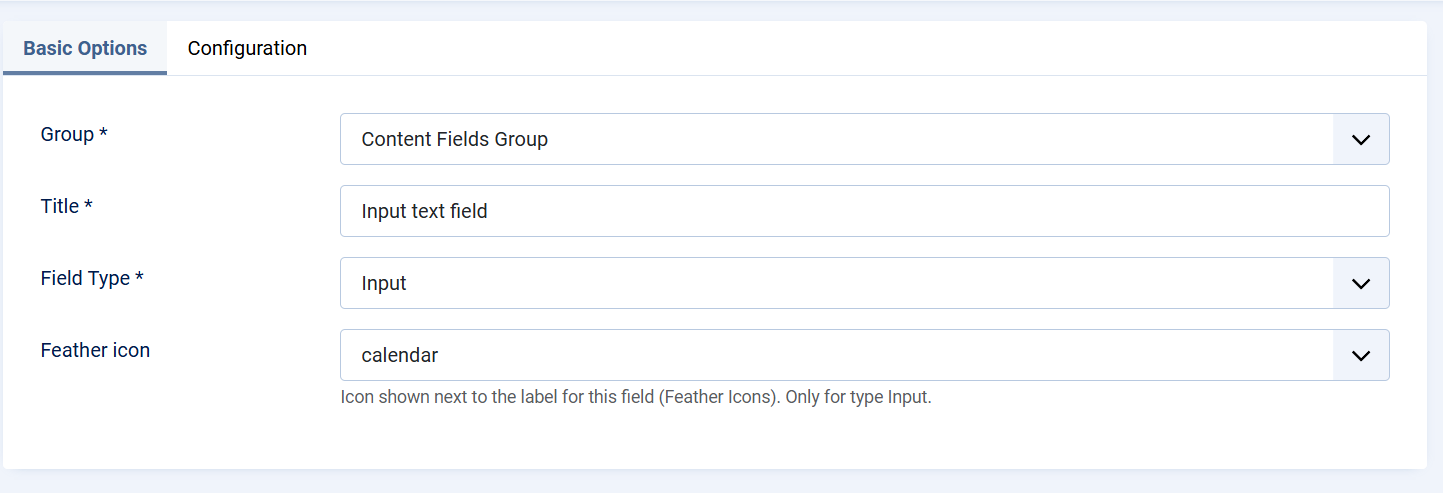
Basic Options
-
Group
Select the Field Group this field belongs to. This determines where the field will appear. -
Title
The label displayed to content editors in the backend. -
Field Type
Defines the type of input used to store data (for example, text input). The field type controls how users enter data and how it is stored. -
Icon (Feather Icon)
An optional icon displayed next to the field label. This improves visual clarity and usability, especially for frequently used fields.
Field Configuration
The Configuration tab controls how the field behaves and how it is presented.
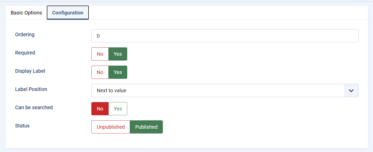
-
Ordering
Determines the position of the field within the form. Lower values appear first. -
Required
When enabled, the field must be filled in before the content can be saved. -
Display Label
Controls whether the field label is visible in the front end of the extension -
Label Position
Defines where the label is displayed relative to the field value (for example, next to the value). -
Searchable
Enables the field to be used in search and filtering features, making the content easier to find on the frontend or backend. -
Status
Controls whether the field is published and available for use. Unpublished fields are not shown in content forms.
Publishing and Visibility
Only published fields that belong to a published field group assigned to the correct content entity will appear in the content editor. This ensures full control over which fields are active and visible to content managers.
Usage in Content
Once configured and published:
-
Custom fields appear automatically in the content edit view.
-
Values entered by editors are stored with the content item.
-
Fields can be displayed on the frontend, used for filtering, or included in layouts depending on the component configuration.
Best Practices
Custom Fields Group
Custom Field Groups
Custom Field Groups in OneCore are used to organize related custom fields and control where and how those fields are displayed. A field group acts as a container that defines visibility, context, and layout placement for all fields assigned to it.
Field groups must be properly configured and published in order for their fields to appear in content or event edit forms and on the frontend.
Group Details
Title and Description
-
Title
The name of the field group. This title can optionally be displayed in the frontend, depending on display settings. -
Description
An optional description that explains the purpose of the group. This can also be shown or hidden based on configuration.
Entity Assignment (Visibility)
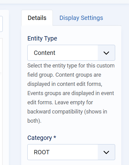
The Entity Type determines where the field group is available:
-
Content
The group and its fields appear in standard content (listing/article) edit forms. -
Events
The group and its fields appear in event edit forms. -
Empty (Backward Compatibility)
If no entity type is selected, the group will be visible in both Content and Events.
Only field groups assigned to the correct entity type will be visible when creating or editing items of that type.
Category Assignment
-
Category
Defines the category scope in which the field group is available.
UsingROOTmakes the group available globally, while selecting a specific category limits visibility to that category and its children.
Display Options
Show Title
Controls whether the group title is displayed on the frontend.
Show Description
Controls whether the group description is displayed on the frontend.
Ordering
Defines the position of the field group relative to other groups. Lower values appear first.
Status
Only Published field groups are active and visible. Unpublished groups and their fields are hidden from both backend forms and frontend output.
Display Settings
The Display Settings tab defines where the field group is rendered on the frontend. These settings apply to all fields within the group.
Position (Items List)
Controls where the group is displayed in list or grid views (for example, category listings).
-
Under Intro Text
The group is shown below the item’s intro/summary text.
Position (Single Item)
Controls placement when viewing a single content item or event.
Position (Module)
Controls how the field group is rendered when used inside a module.
-
Allows the same group to be reused consistently across different module-based layouts.
Publishing Rules and Dependencies
For custom fields to appear correctly:
-
The field group must be published
-
The field group must be assigned to the correct entity type
-
The custom fields within the group must also be published
-
The group’s display settings must match the active layout (list, single item, or module)
If any of these conditions are not met, the group and its fields will not be visible.
Best Practices
-
Create separate field groups for Content and Events to keep structures clear.
-
Use Display Settings to avoid cluttering main content areas.
-
Place informational or secondary fields in the sidebar for better readability.
-
Use ordering to control the logical flow of information.