J|Comdev
Comdev Framework - Common usability shared between extensions
Address
Overview
The Address feature, as the name suggests, lets you provide the country, region and city for the respective product listing. The advantage with the Address field in Extensions is that after you configure a particular address, it is shared across various components in the Comdev extension.
Based on the depth of levels you want, such as the continent as Europe, country as the UK and region as Wales, you can configure the Address tree to have unlimited levels. The Address feature provides multilingual support. This means you can specify different names based on your language preference. For more information, see Languages.
Creating A New Address
The following image shows the Address Feature screen. To add an address, click Components > Comdev > Address. Click New to create a new address.
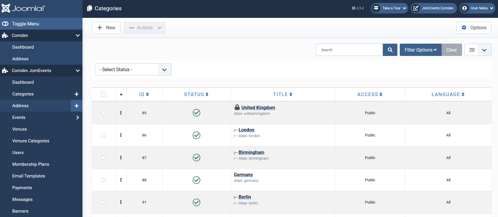
Screen 1: New Address screen
Let us understand each of the buttons seen on the screen using the following table.
|
New |
Creates a new Address entry. You must create separate entries for each level of depth that you need. |
|
Edit |
Provides the edit mode to make changes to the existing level or titles created. |
|
Publish |
Publishes the created address entry. |
|
Unpublish |
Removes the entry from the list of published address entries |
|
Archive |
Archives address entries that are not used anymore. |
|
Trash |
Deletes the address entry that is not required anymore. |
|
Rebuild |
Refreshes to incorporate the changes made to the entries in the Address feature. |
Address Structure
The structure of the Address tree is maintained as follows in our example. You can create any structure as per your requirement.
<Continent>
-- <Country>
-- – <Region>
-- – -- <City>
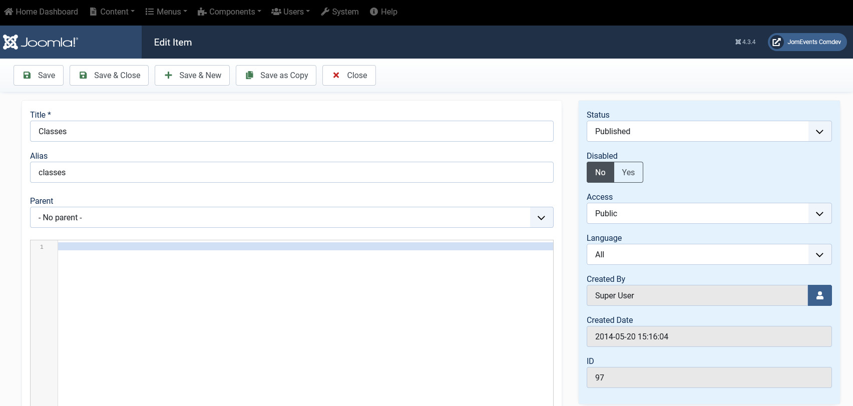
Editing address entries
If you want to edit existing entries, you can either click the entry from the Address screen or select the check box next to the entry, and then click Edit.
After you click the required entry that you need to edit, you can change the configurations based on the options as seen in the following table.
|
Title |
Custom Address Field |
|
Alias |
URL alias for “SEF/SEO” URL |
|
Parent |
Select the parent address entry |
|
Text box |
Provide a description about the entry. You can format the text using the formatting options in the text box. You can also insert images or links to URLs for more information. |
|
Category Image |
Upload an address image |
Publishing tab
After you have provided the above information, you can provide the publishing information in the Publishing tab as seen in the following image.
You can change the values for the given options using the following table.
|
Status |
Based on the status seen here, the visibility changes as follows:
|
|
Access |
Access level for site users is as follows:
|
|
Language |
Select the language for the address entry. |
|
ID |
Address ID, which can be used in modules, plugins and menus. |
|
Created by |
User name who created the entry. |
|
Created Date |
Date when the entry was created. |
|
Modified by |
User name who modified the entry. |
|
Modified Date |
Date when the entry was modified. |
Metadata tab
The metadata tab is used to provide metadata information for a particular address entry. The options for this tab can be seen as shown in the following image.
You can change the values for the given options using the following table.
|
Meta Description |
Meta-description for search-engine listings. |
|
Meta Keywords |
Meta Keywords for the search-engine |
|
Author |
Content author metadata. |
|
Robots |
Robots instructions:
|
Categories
Overview
Categories allow the site owner to categorize listings into appropriate sections. Extension categories are independent from the Joomla category system. Nested categories (sub-categories) are supported in Extension. Component comes with a category named "UNCATEGORIZED", which is the default setting. This category holds listing items that are not attached to any category (same function as the default Joomla system).
You can create a categories menu link under Menus using information provided here. Ensure that for creating this link you use the Item menu type as Categories.
Creating A New Category
The following image shows the Category Feature screen.
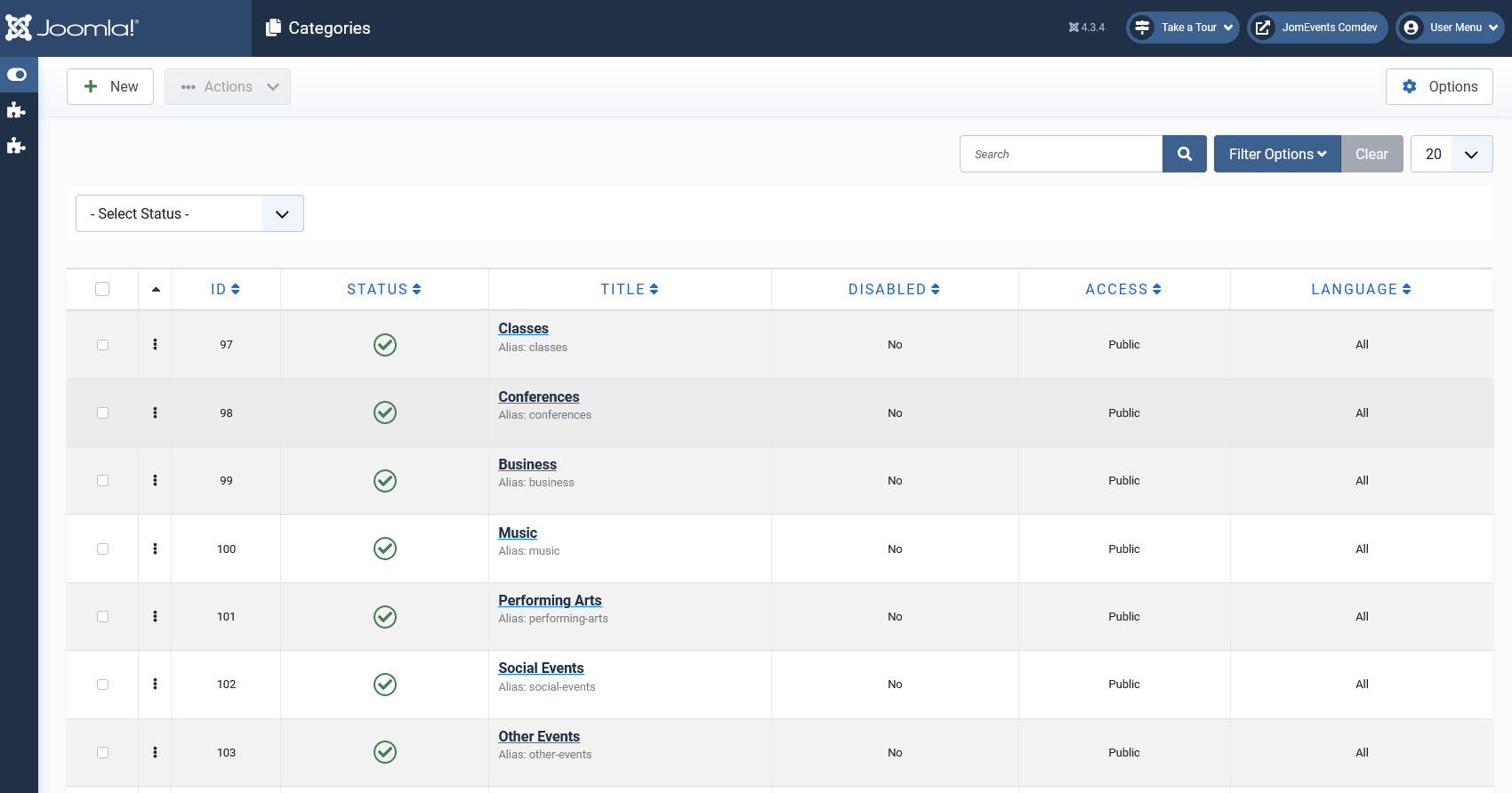
Screen 1: Adding a new category
Let us understand each of the buttons seen on the screen using the following table.
|
New |
Creates a new Category entry. You must create separate entries for each level of depth that you need. |
|
Edit |
Provides the edit mode to make changes to the existing level or titles created. |
|
Publish |
Publishes the created category entry. |
|
Unpublish |
Removes the entry from the list of published category entries |
|
Archive |
Archives category entries that are not used anymore. |
|
Trash |
Deletes the category entry that is not required anymore. |
|
Rebuild |
Refreshes to incorporate the changes made to the entries in the Category feature. |
Editing category entries
If you want to edit existing entries, you can either click the entry from the Category screen or select the check box next to the entry, and then click Edit.
New Category tab
The New Category tab is seen as shown in the following image:
Screen 2: New Category tab
After you click the required entry that you need to edit, you can change the configurations based on the options as seen in the following table.
|
Title |
Custom Category Field |
|
Alias |
URL alias for “SEF/SEO” URL |
|
Parent |
Select the parent category entry |
|
Text box |
Provide a description about the entry. You can format the text using the formatting options in the text box. You can also insert images or links to URLs for more information. |
|
Toggle editor |
Toggle between a rich text box with formatting options and plain text box. |
|
Category Image |
Upload a category image |
Publishing tab
After you have provided the above information, you can provide the publishing information in the Publishing as seen in the following image.
You can change the values for the given options using the following table.
|
Status |
Based on the status seen here, the visibility changes as follows:
|
|
Access |
Access level for site users is as follows:
|
|
Language |
Select the language for the category entry. |
|
ID |
Category ID, which can be used in modules, plugins and menus. |
|
Created by |
User name who created the entry. |
|
Created Date |
Date when the entry was created. |
|
Modified by |
User name who modified the entry. |
|
Modified Date |
Date when the entry was modified. |
Metadata tab
The metadata tab is used to provide metadata information for a particular category entry. The options for this tab can be seen as shown in the following image.
You can change the values for the given options using the following table.
|
Meta Description |
Meta-description for search-engine listings. |
|
Meta Keywords |
Meta Keywords for the search-engine |
|
Author |
Content author metadata. |
|
Robots |
Robots instructions:
|
Custom Fields
Overview
Custom fields are a powerful tool to build content. We provide a variety of field types with the ability to outline into groups. Each field can be assigned into a single category or all categories.
Creating a Custom Field
Creating a custom field involves setting certain options. To create a custom field, click New as shown in the following image.
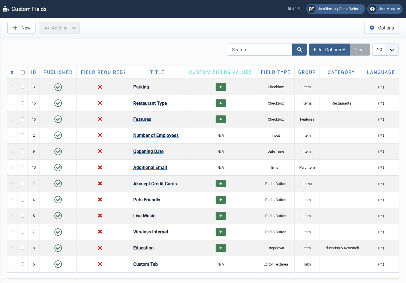
Screen 1: Custom Field screen
The following table explains the different options available on the screen.
|
New |
Creates a new Custom Field. |
|
Edit |
Provides the edit mode to make changes to the existing level or titles created. |
|
Publish |
Publishes the created custom field. |
|
Unpublish |
Removes the entry from the list of published custom fields. |
|
Archive |
Archives custom fields that are not used anymore. |
|
Trash |
Deletes the custom fields that are not required anymore. |
|
Options |
Navigates to the Extension options screen. |
Editing Custom Fields
If you want to edit existing entries, you can either click the entry from the Custom Fields screen or select the checkbox next to the entry, and then click Edit.
Custom Field Edit
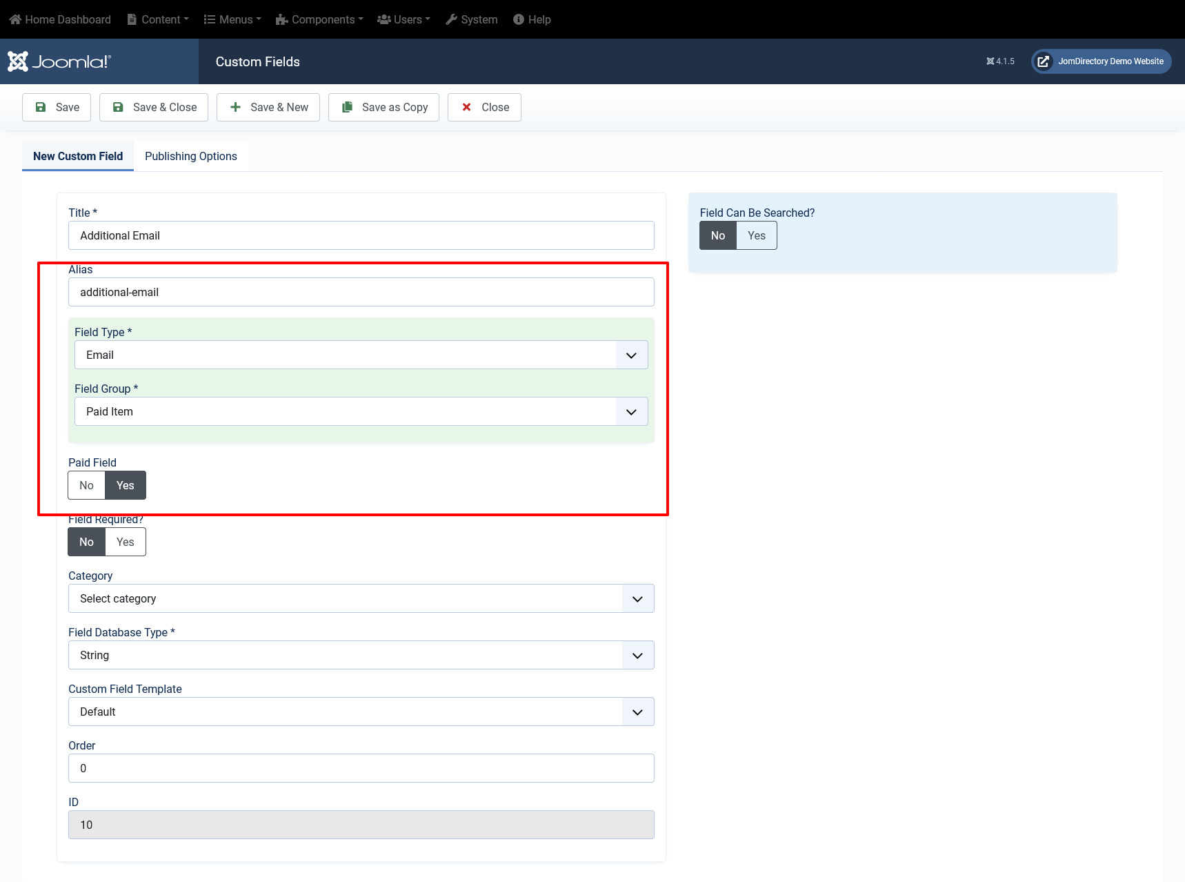
After you click the required entry that you need to edit, you can change the configurations for the fields as shown in the following image.
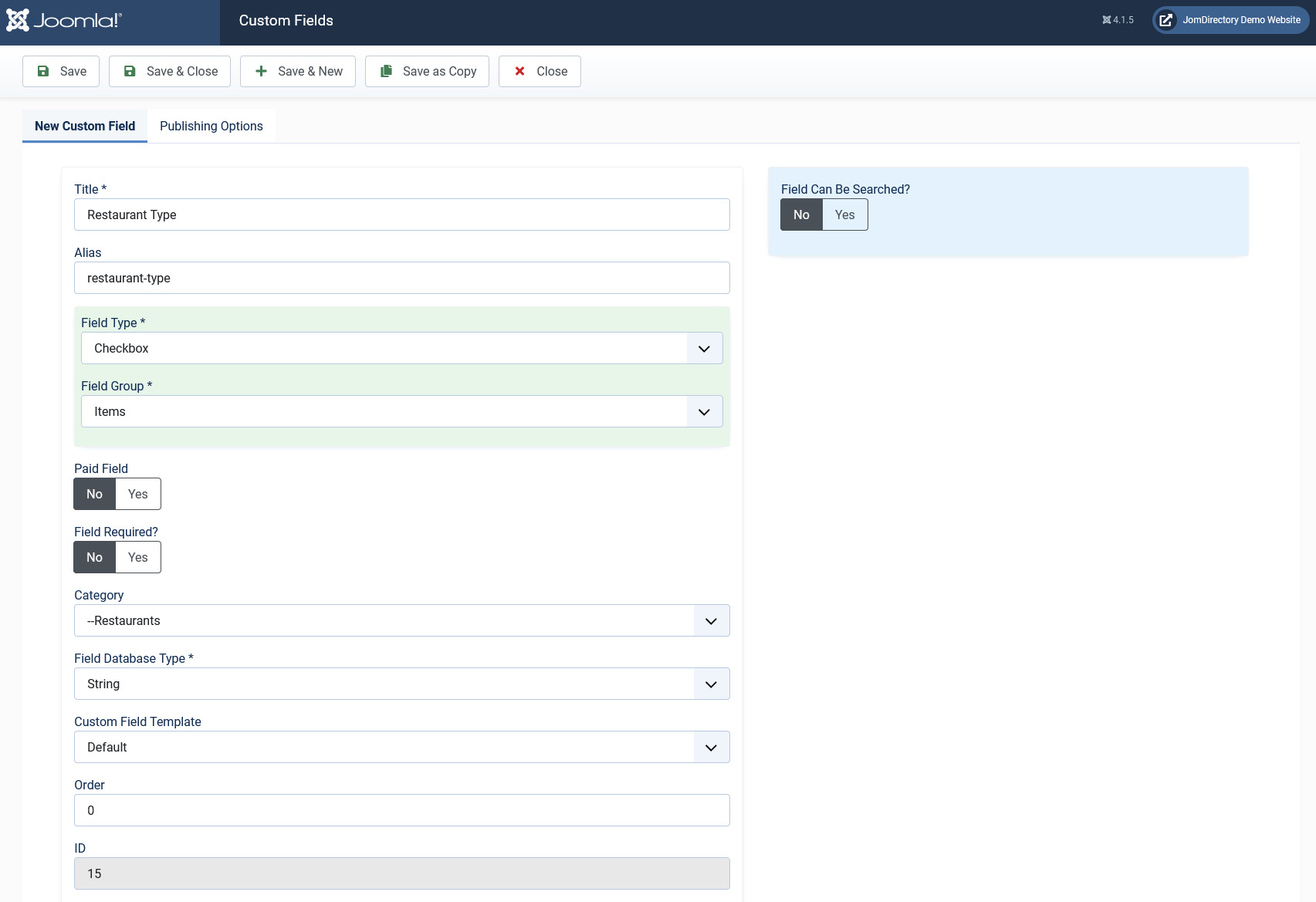
Screen 2: Custom Field Edit tab
The following table explains the different options seen on the screen:
Custom Field Edit |
Title |
Title for the Custom Field. |
|
Alias |
URL alias for “SEF/SEO” URL. |
|
|
Order |
Provide a value from 1 onwards. The lowest value will appear on the top. |
|
|
Field Required? |
Enable whether to make the field required. |
|
|
Category |
Category where the Custom Field will be published. When you select a custom field for a particular category, it is visible only for that category. While creating a listing if you select the said category and save, the custom field is available only then.
|
|
|
Field Type |
Set the Field Type for the Custom Field. For more information, see the Field Type Table. |
|
|
Field Database Type |
Set the field type, needed for database settings.
|
|
|
Field Group |
There are 5 custom field groups. Custom fields are grouped into groups. It has many advantages, one of them is display purposes. There are few groups available:
JomEstate, JomEvents only
Groups are static and cannot be created.
Paid groups are related to the membership plans that are applied to custom fields. Paid Items are displayed in the Items list, while the Paid Item is displayed in an Item (detailed) view.
|
|
|
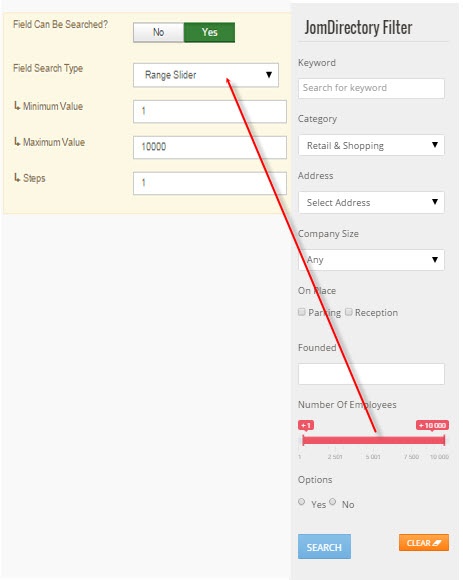
Field Can Be Searched |
Enable to make the field values searchable. This setting applies only for the Search Module -> Layout Filter.
|
|
|
Field Search Type |
Provide the type of search option to include:
Depending on the Field search type you select, the search criteria field will be displayed in the search module – layout side search. This field is functional when the Field Type is selected as Input and Field can be searched set to Yes
|
|
|
Minimum Value |
When, as an example, the Range Dropdown option is selected, you can select the range between which the options can be selected. For example, for Price range between X and Y, with incremental steps of 2, you can set x value in this field. |
|
|
Maximum Value |
Set the Y value for the range in this field. |
|
|
Steps |
Define the incremental steps. For example, for increments of x+2, provide the value as 2. |
|
|
Custom Field Template |
Custom fields have own templates that can be used and customized. There are 3 templates available:
If you would like to create and customize your own templates, see the Developer Guide. |
|
|
ID |
This field is auto - generated. |
|
Custom fields values area |
Add new |
If the field type is selected to hold multiple values, this button lets you create the multiple values. |
|
Delete |
Delete the value. |
Custom Field Values
This area lets you create values when the field type requires multiple options to be provided.
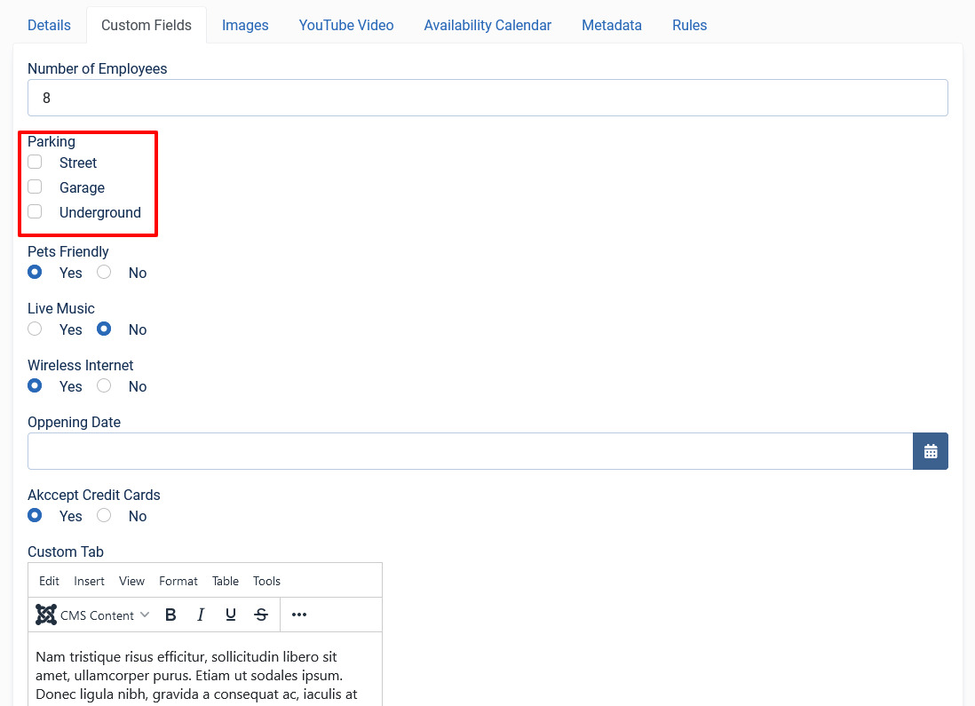
For custom fields that can have values, to add multiple values, navigate to the custom fields listing screen. Click the  icon next to the field where you want to add values as shown in the following image.
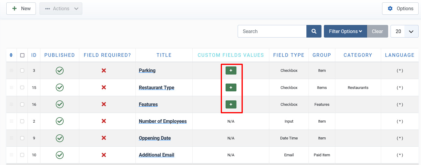
Screen 3: Adding values to custom fields area
Here, the Field Type is selected as Checkbox and the Field Database Type has been stated as String. This means the Custom fields value area should provide options that can be seen when editing listing and displayed on the component front page. Hence, the Sample Values are provided in this area as Street, Garage, Underground. The following screen shows the values added at the back end. Click Delete to delete the entry.
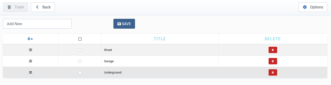
Screen 4: Values added to custom field area
The following image shows how the field looks on the add listings page.
Screen 5: Custom Field as seen on new listing page
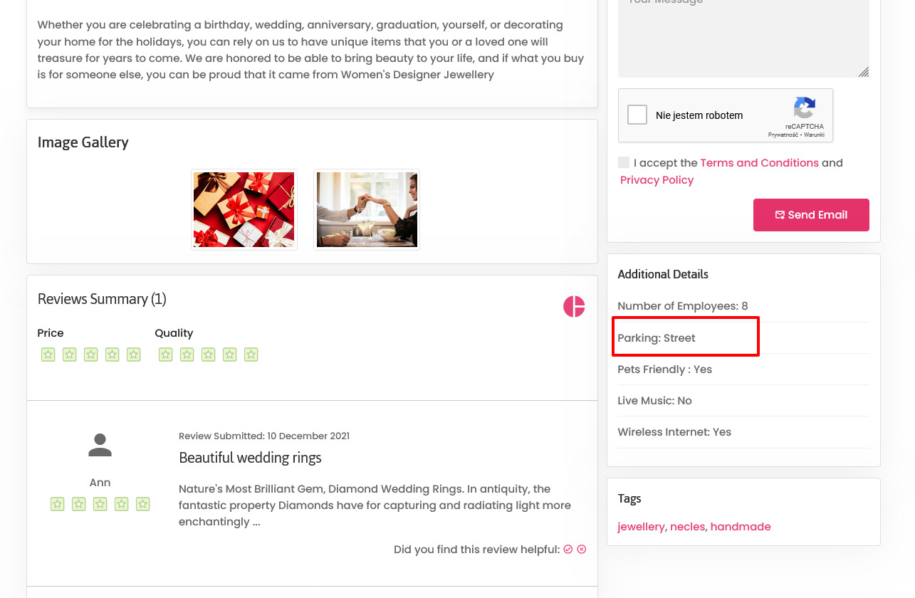
The custom field is seen on the listings page as shown in the following image:
Screen 6: Custom Field as seen on published listing page
Field Types
With Extension extension, you get several field types that you can create based on your requirement. The following image shows the available field types.

Screen 7: Field Types
The following table explains the different options seen on the screen.
|
Type |
Multiple select |
Multiple Values |
Description |
|
Radio button |
No |
Yes |
Standard radio button with multiple values |
|
Checkbox |
Yes |
Yes |
Standard check boxes with multiple values |
|
Dropdown |
No |
Yes |
Dropdown (select) field with multiple values |
|
Multiple Select |
Yes |
Yes |
Select box with multiple values |
|
Input |
No |
No |
Single text box |
|
Web Address |
No |
No |
Single text box for URL, it will display as the link in the front page |
|
|
No |
No |
Single text box for email |
|
Text |
No |
No |
Text area |
|
Date Time |
No |
No |
Select a date and time from the Calendar icon on screen. |
|
Date |
No |
No |
Select a date from the Calendar icon on screen. |
|
Editor textarea |
No |
No |
Creates a rich text editor box, it can be combined with Tabs group. |
Publishing tab
After you have provided the above information, you can provide the publishing information in the Publishing tab.
You can change the values for the given options using the following table.
|
Status |
Based on the status seen here, the visibility changes as follows:
|
|
Language |
Select the language for the address entry. To create a custom field that applies to a particular language, you need to select the appropriate language from the drop down. For each language that you want it to appear for, create a separate entry.
|
|
Created Date |
Date when the entry was created. |
|
Start Publishing |
Date when publishing needs to start in case of limited viewing of the field. |
|
Finish Publishing |
Date when publishing needs to stop in case of limited viewing of the field. |
|
Modified Date |
Date when the entry was modified. |
Membership
Overview
Memberships in Extension are required to set user group level based on the monthly/Yearly pay plan the user selects. Using membership plans, you can decide how much to charge a user and how many listings a user can make for a particular membership plan.
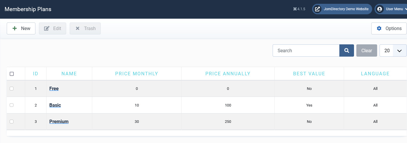
Create a new Membership Plan
Click Components > Extension > Membership Plans > New to create a new membership plan as shown in the following image:
Screen 1: Create new membership plan
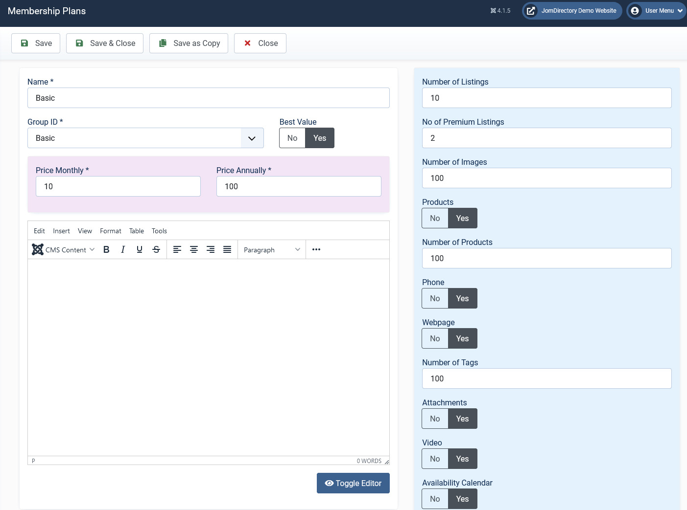
Edit Membership Plan
If you want to edit existing entries, you can either click the entry from the Membership screen or select the check box next to the entry, and then click Edit.
The following image shows the Edit Plan screen.
Screen 2: Edit Plan screen
The following table explains the different options seen.
|
Name |
Provide a name for the membership plan. |
|
Number of Listings |
Provide the number of listings the users in the plan can create. |
|
Group ID |
Select the Joomla user group ID for the plan. It is recommended that you create your membership under the Registered group.
|
|
Number of Images |
Provide the number of images the users in the plan can add. |
|
Price Monthly |
Provide the monthly charge for the plan. |
|
Price Annually |
Provide the annual charge for the plan. |
|
Best Value |
Best value badge, that shows in Front Admin (informative) |
|
No of Premium Listings |
Provide the number of premium listings the users in the plan can create. |
|
Attachments |
Enable to allow users to add attachments to listings. |
|
Video |
Enable to allow users to add Video link to the listings. |
| Custom Fields |
Enable custom fields for particular plan. Custom field needs to be assign into Paid Groups to be shown here.
|
|
ID |
This field is auto generated. |
Adding paid custom fields to the Membership plans
For adding a custom field to the membership plan, the field group needs to be set to Paid item. Click Extension > Custom Fields. Click the field you want to add to the membership plan as a paid item. Change the Field Group to Paid item for the Item view and Paid items for the Items view as shown in the following image:
Screen 4: Adding a paid custom field
This field needs to be enabled in the membership plan as shown in the following image.
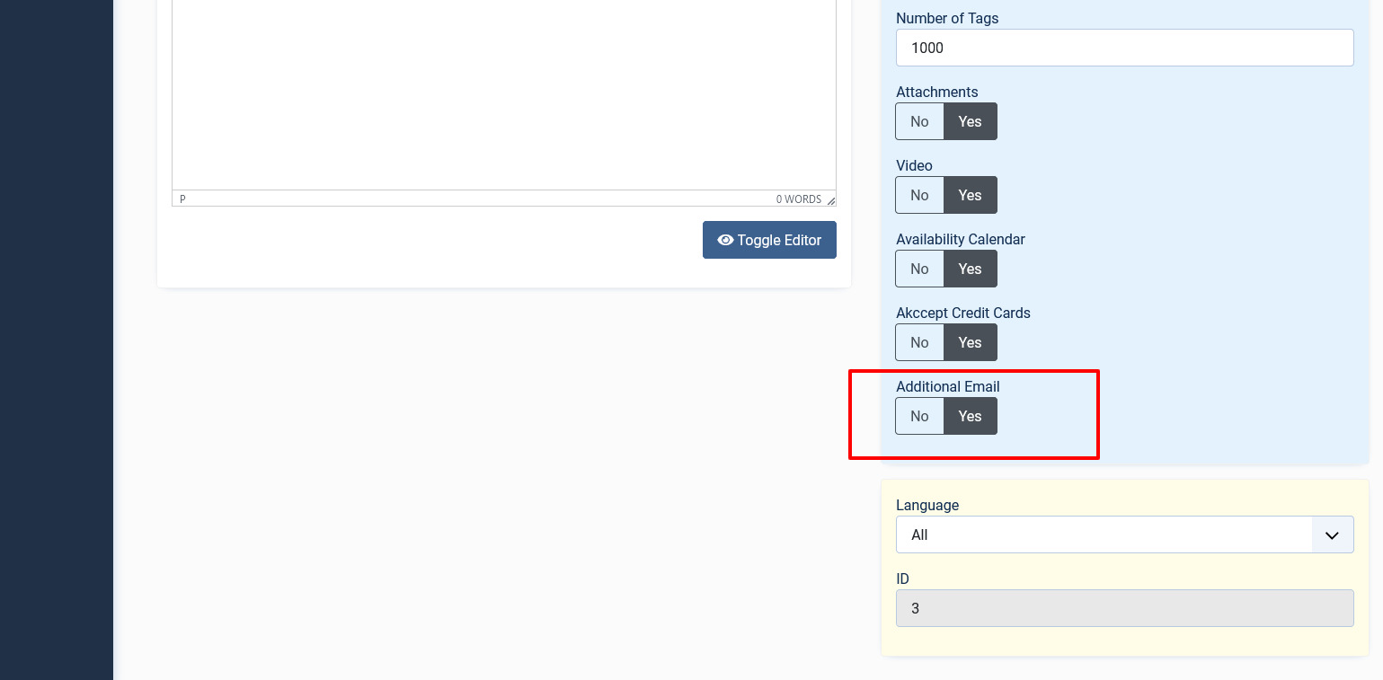
Screen 5: Enabling the paid custom field
This field can be seen in the front admin under the membership plan as follows:
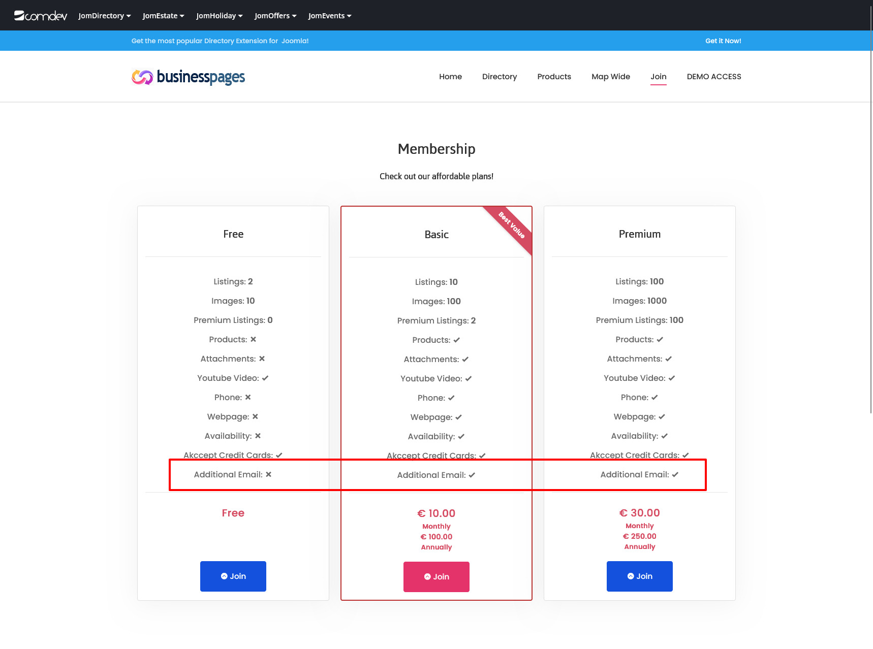
Screen 6: Viewing the paid custom field
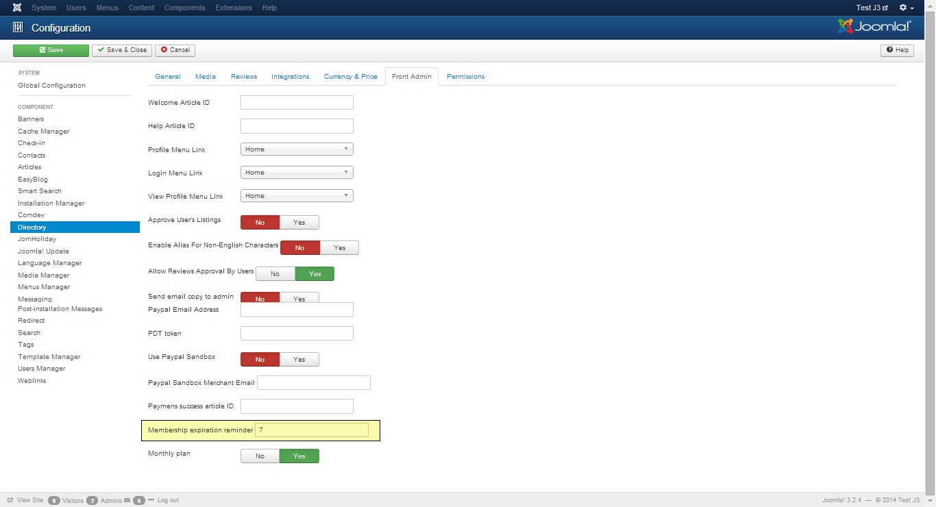
Membership expiry email configurations
Before the membership expires, an email can be sent to a user that informs them about his membership nearing expiration. The setting can be seen in the following image:
Screen 3: Configure expiry email field
Cron Setting for Membership expiry check
Under your hosting panel a link needs to be added that launches a script. This script checks all users’ membership and sends an email if membership is about to expire:
curl -sS 'http://yourdomain.com?option=com_jomdirectory&task=expiry.send'or
wget -q -O /dev/null 'http://yourdomain.com?option=com_jomdirectory&task=expiry.send'If you are unaware about where the cron setting needs to configured in the hosting panel, contact your hosting support center.
Ensure that the script is launched every day at a particular time consistently.
Set Single User expiry date and group
To set plan expiry and attach a group for each user, do the following:
- Click Users > User Manager.
- Click the user for whom you want to set the membership expiry.
- Click the Additional Options tab.
- Provide the expiration date in the Plan expiry field.
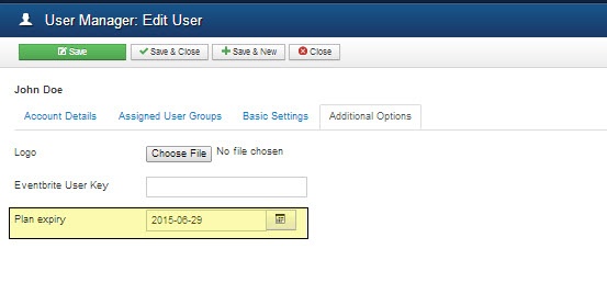
- Click the Assigned User Groups tab.
- Select the check box next to the group you want to attach the user to for a particular membership plan as shown in the following image.
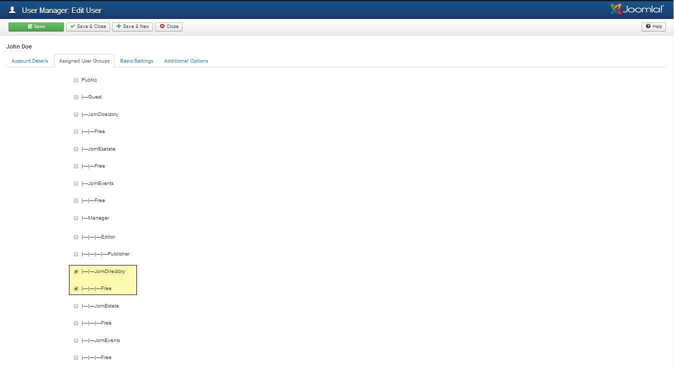
- Click Save.
For more information about membership expiration setting, see Configuration documentation.
Reviews
Overview
Reviews are provided by users and can be seen on the Reviews tab in the listing.
Creating Reviews Categories
Review categories can be seen on the Reviews tab in the listing to the user when they are adding a review for that listing as seen in the following image.
Screen 1: Reviews Category screen
Click on category type to edit it:

Screen 2: Add a category for review on listing page
Creating Reviews Recommended
Review recommended can be seen on the listing details Reviews tab in the listing to the user when they are adding a review for that listing as seen in the following image.
Screen 3: Reviews Recommended screen
Click on category type to edit it:
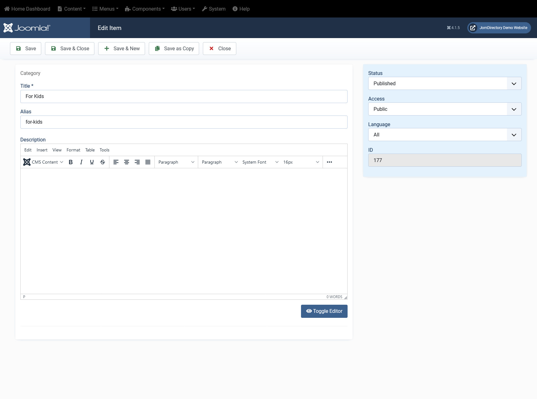
Screen 4: Review Recommended on Listings page
Note: If the reviews are not being shown after submission on the listing page, you must enable Approve Reviews option under component Configuration. For more information. See Configuration documentation.
Adding a Review for listings
After these categories and review recommendation types are added, you can now create a review. To create a review, go to the listings page and click the Reviews tab. Provide the options as seen in the following image:

Screen 5: Adding a Review
After you provide the information, click Submit Review. The Review can now be seen in the listings page, under the Reviews tab.
Editing a review
Now, you can view the review and edit it, if required. Click Extension > Listings. The following image shows the Reviews column for the listings.
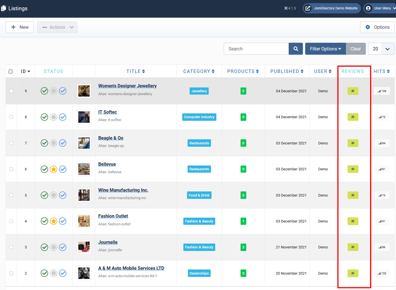
Screen 6: View the Review column
Click the  Review icon to view all the reviews for a listing.
Now click on the review title to edit it:
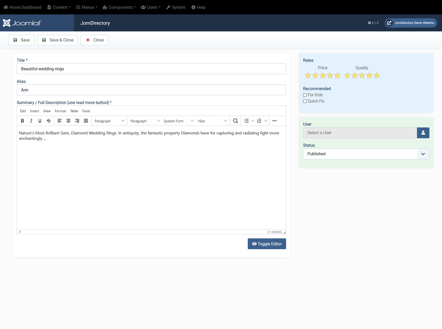
Screen 7: Editing a review
Edit the options as given in the following table.
|
Title |
Edit the title for the review. |
|
Alias |
Edit the alias for the review. |
|
Text Editor |
Edit the description in the editor. |
|
Toggle Editor |
Toggle between rich text and plain text editor. |
|
Rates |
Move the cursor over the circle to edit the given categories. |
|
Recommended |
Select the required recommended for group. |
|
User |
Select the user who created the review. |
|
Status |
Change the status of the review.
|
Review on front page
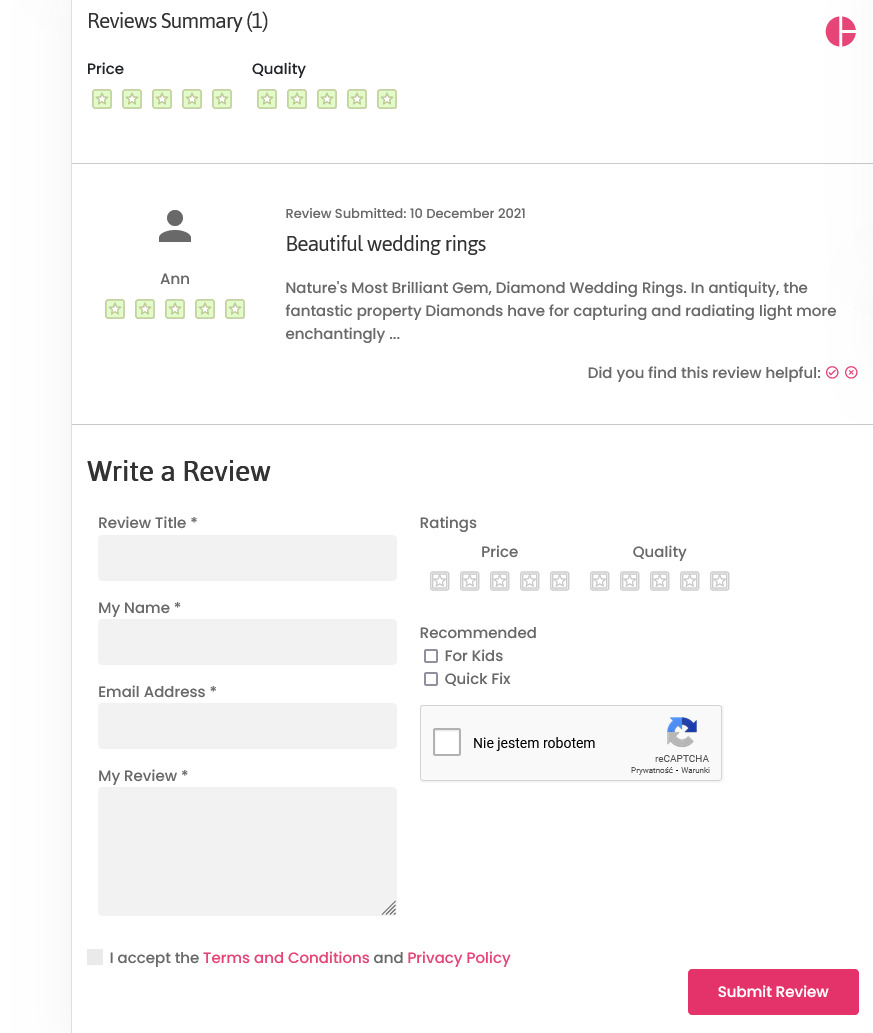
After these types are added, when a user is writing a review, the options are seen as follows:
Messages
Overview
Additional send email copy to admin can be set under Configuration
The messages are always sent to the owner of the listing. The user email address is taken from the User Account settings.
The Contact area on the listing page is as seen in the following image. The options are provided as given here:
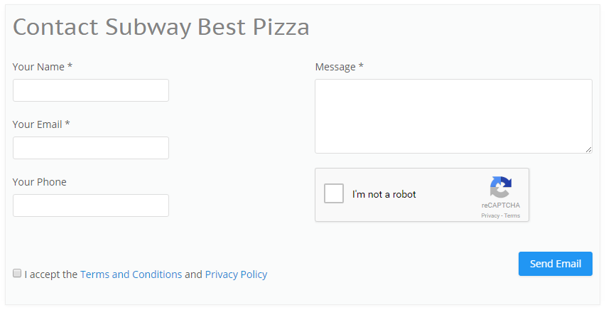
Screen 1: Sending a message on the site
Viewing messages
Once the user accepts the Terms and Conditions and the Privacy Policy, he clicks Send Email. The email is now available for the owner of the listing to view as seen in the following image:
To view a message, hover the mouse pointer over the message as shown in the following image.
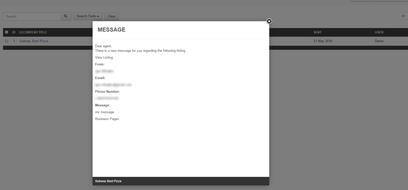
Screen 2: View the message
Messages sent using the contact form are available on the Messages tab for the owner of the listings. You can view the message or delete it based on your requirement.
Front Admin Messages
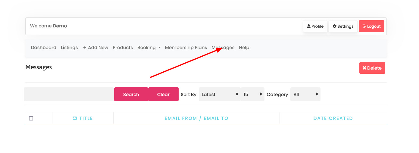
To view messages, from Front Admin, click the Messages tab to see the following screen.
MODULES
Common Modules for the extensions
Live Search Maps Module
Overview
This is an extra paid module available for Business Package, can be also purchased separately.
This module helps you view all the listings under full view or windowed map To view all the available modules, click Extension > Module Manager.
To create a new module, click New. Select the EXTENSION_NAME Maps module. Provide the information as given in the following sections. Click Save to save the module.
Editing the Maps Module
To edit the module, click on the module link or select the checkbox next to the module name, and then click Edit.
The following image shows the module edit screen.
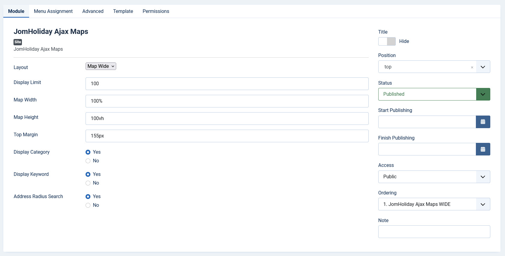
Screen 2: Module tab
Module tab
This tab controls the layout where the search panel is to be displayed on the screen.
Screen 3: Module tab
Provide the options as per the following table.
|
Layout |
Select the required layout in the Layout field. The available options are: Maps Wide – layout with the search module on the left side and big map area on the right side, as seen in the following image: 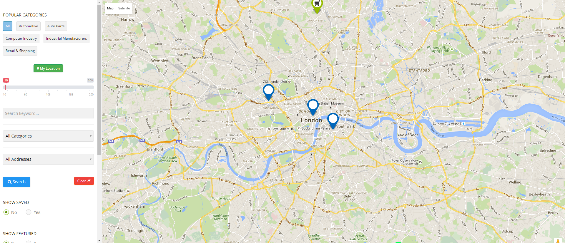
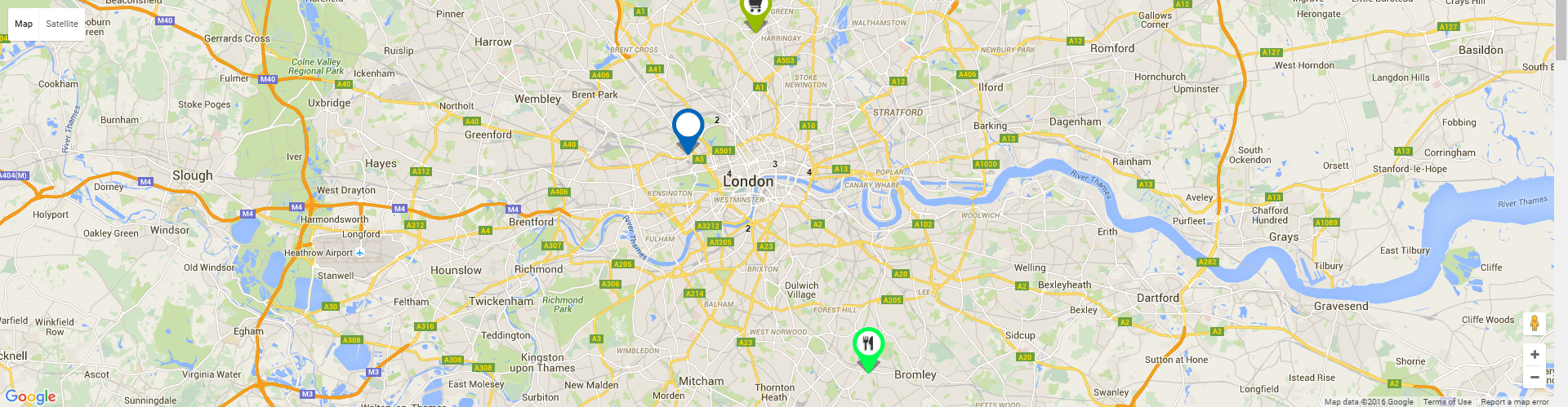
Maps – layout showing items on a map as seen in the following image: |
| Display limit | Limit number of items shown on the map |
| Map width | Set width of the map |
| Map height | Set height of the map |
|
Top margin |
Set top margin of the map |
|
|
Display category selection on the left of the wide map layout |
|
|
Display address selection on the left of the wide map layout |
|
|
Display keywords selection on the left of the wide map layout |
|
Position |
Select the position based on your Joomla Template. |
|
Start Publishing |
Provide a date when the search panel should be published. |
|
Finish Publishing |
Provide a date when the search panel should be unpublished. |
|
Access |
Provide access level for the panel.
|
|
Ordering |
Provide the order in which the side panel should appear. If more than one module is positioned at the same location, you can set the order of appearance in this field. |
|
Language |
Select the language for which you want to display this panel. For each language, you must create a new JomDirectory Search module. |
|
Note |
Provide additional information. |
Menu Assignment tab
This tab controls where the module should be displayed. You can decide if it should be displayed on all pages for the site or just selective pages.
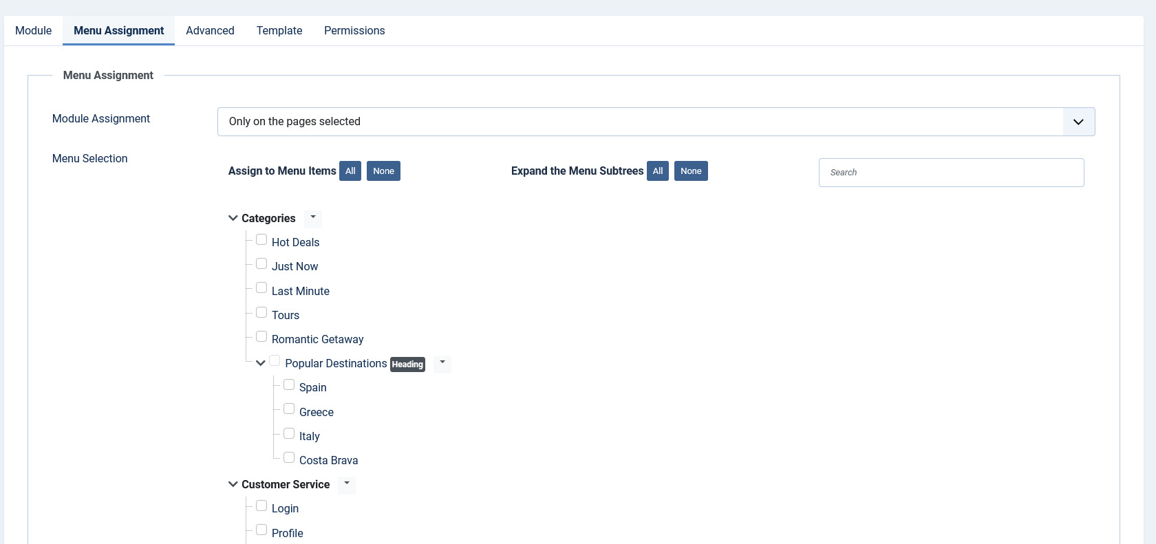
Select the required menu for module assignment. The available options are:
- On all pages
- No pages
- Only on the pages selected
- On all pages except those selected
Creating custom category markers
When any listing is displayed on the map, it is shown as a pin. This pin icon is as in the default template. To modify this pinned icon as per your category, marker image needs to be placed under module images directory:
modules/mod_EXTENSION-NAME_maps/images/markers/...Slideshow PRO Module
Overview
This is an extra paid module available for Business Package, can be also purchased separately.
This module showcases the listings in a slideshow format. Users can see the image along with the title of the listing.
Slideshow PRO Module upon activation is seen as follows on the pages:
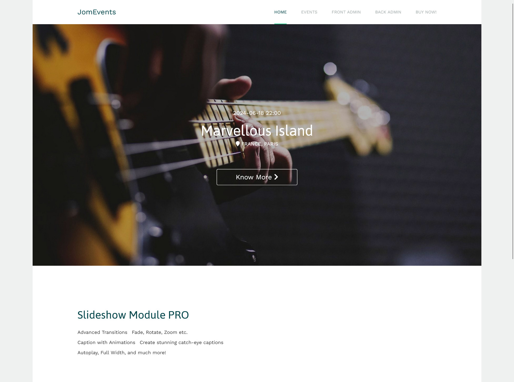
Screen 1: Slideshow Module on front page
Editing Slideshow Module
To edit the module, click on the module link or select the check box next to the module name, and then click Edit.
The following image shows the module edit screen.
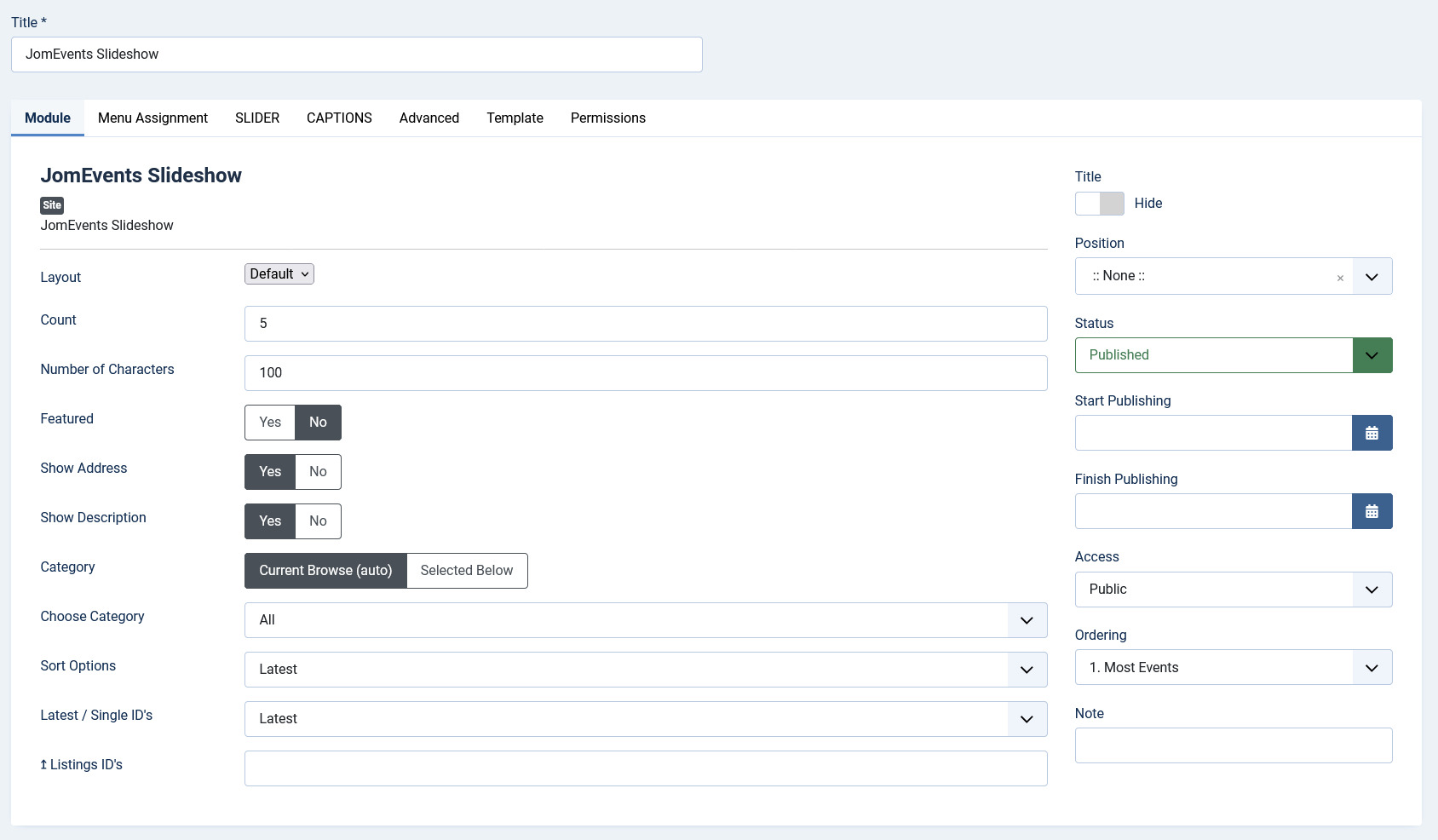
Screen 2: Module tab
Provide the options as per the following table.
|
Count |
Number of listings for which images need to be shown in the slideshow |
|
Number of characters |
Number of characters from the description that will be shown in the slideshow. |
|
Image Format |
The format for the thumbnail listing image. |
|
Featured |
Enable to show only featured listings. |
|
Show Address |
Enable to show the address of the listing. |
|
Show Description |
Enable to show the description up to the character limit set. |
|
Category |
Select either of the following options.
|
|
Choose Category |
If Selected Below is selected for the above field, select the required category. |
|
Sort Options |
Select how the displayed listings should be sorted by.
|
|
Use Listings IDs |
Enable to make the next set of settings work. |
|
IDs CSS Item Styling |
Provide comma separated IDs in this field. Such as, 21, 22 and so on. |
|
Use IDs for the CSS Classes |
If set to yes, to each Caption, CSS Class ID will be added e.g. .jd-slide-title21 where 21 is ID of the listing. Listing ID can be found under JomEvents Listing View in Table - Column ID. It works best with Use Listings ID's setting You can select individual listings and promote them with different captions. If set to No, the default CSS will be used for all captions. |
Slider Module Tab
This tab controls the layout where the map panel is to be displayed on the screen.
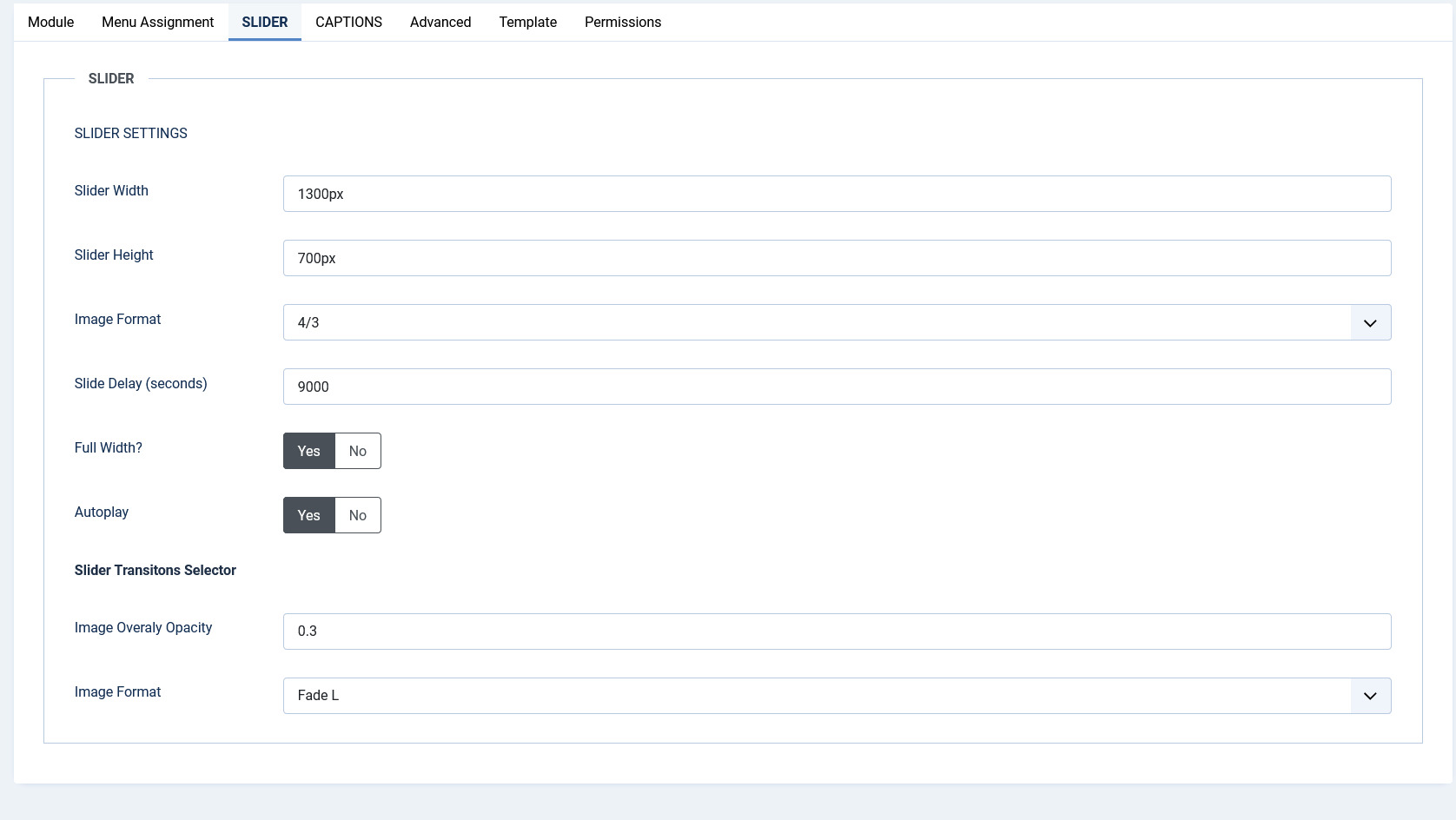
Screen 3: Slider Module tab
|
Slider Width |
Slider width in pixels |
|
Slider Height |
Slider height in pixels |
|
Slide Delay (seconds) |
Slideshow delay in seconds |
|
Full Width |
Enable to cover the entire width of the slideshow image. |
|
Slide Transition |
Select from the following options.
|
|
Slide Navigation |
Select from the following options.
|
|
Autoplay |
Start slider when page loaded |
Menu Assignment tab
This tab controls where the module should be displayed. You can decide if it should be displayed on all pages for the site or just selective pages.

Select the required menu for module assignment. The available options are:
- On all pages
- No pages
- Only on the pages selected
- On all pages except those selected